

Sarah Stern has provided the rich color work I’ve appreciated in many BOOM! titles, including Goldie Vance and Giant Days. At FlameCon this summer, I was excited to meet her and to be introduced to her webcomic, Cindersong.
Sarah, whose business card reads, “Comics Person,” balances between solo work on Cindersong and color work on various projects, including Mighty Morphin’ Power Rangers: Pink, Star Trek and Star Wars titles published by IDW, and an impressive range of other books as well. Right now she is doing color work for By Night, a series by John Allison and Christine Larsen published by BOOM!, which Sarah calls “excellent” and which our own Claire Napier discussed in July.
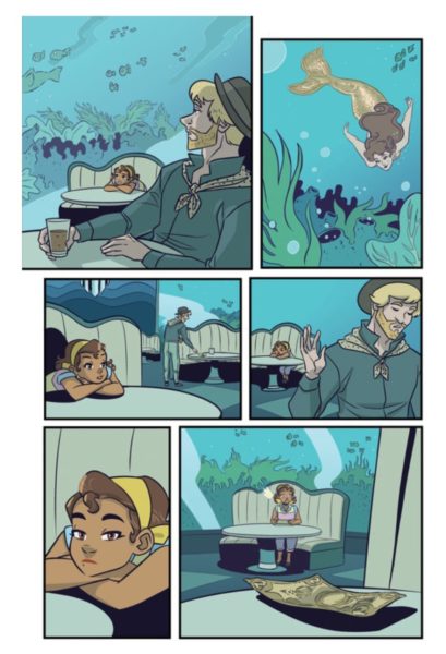
Cindersong is currently in its second chapter. So far, it is a swashbuckling heist in a high fantasy setting, with more racial diversity and queer representation than one might expect from that description. It’s fun and immersive.
Even though she was on her way out of the country and putting Cindersong on a temporary hiatus while away, Sarah kindly answered my questions about how she approaches her color work, and about how she approaches her solo work and the world of Cindersong.
When you are doing work as a colorist, what is a thing you particularly enjoy about that process?
I’ve had the very good fortune to work on a lot of books that I genuinely enjoy as a reader, so getting to see inks up close and personal is a real treat. I like making pages feel polished when I hand them off, it’s satisfying to think I added something important to a story and brought more clarity and zazz to the art!
Do you have a system for developing a color palette for a project, or does it vary by book and creative team?
I generally know what I want to do as soon as I see the pages. The artist’s style, the tone of the story, and details in the script are usually enough to give me a starting point from which to make color decisions. Licensed comics come with their own palettes and specific character designs but there’s always at least a little stylistic wiggle room there.
When I’m starting from scratch, I find it helpful to make a few color comps to work off of. I’ll take a handful of panels and loosely and quickly apply and blend color in a few different ways until I’ve got something I like, then carry that palette to the final pages.
The decision-making process itself is what usually takes the most time when coloring, but it gets easier the longer you’re on a project (and the longer you’ve been coloring in general). If I get stuck or need inspiration, I’ll pull up illustrations I like (animation backgrounds are a favorite) and play with their hue and saturation to get ideas and reset my brain a little. Gamut maps are also very helpful for coming up with limited color palettes to pick from.
What’s a thing you enjoy about creating your solo work?
I love being able to tell exactly the kind of stories that I want to read. I wouldn’t say that my tastes are eclectic or unusual, but it can be harder to find material that balances the approach to relationships, adventure, and fantasy junk that I really identify with. I also like the freedom of doing pretty much whatever I want to do, as intimidating as that is. It’s also been wonderful to meet and talk to my readers online, the positive feedback has been really wonderful!
I notice that in Cindersong, it seems like a lot of the work of the art is done at the color stage (the rain scenes, ambient noises as background text, etc)—is color always kind of on your mind?
I think it’d be fair to say that color is one of my strongest skills, if only because I’ve logged so many hours into that part of the process! I definitely have most of what I want to do color-wise sorted out when I’m planning a page, even if I’m experimenting with something new. Sometimes that changes as I’m working on a page, but I very rarely go into the color stage without having a concrete idea of what I want to do.

On social media you are “worstwizard”—does this convey a love of the Worst Witch books? What stories and visual art have been most influential to you as a creator?
Haha I actually haven’t read them or seen the show! I couldn’t pick a name when I was setting up social media accounts, and a friend said to just pick something that I liked. I said “I don’t know, wizards?” And they (having probably heard me talk about wizards a few too many times) replied with, “You’re the worst.” That seemed right so here we are! I didn’t realize there was a similarly named series until years later, but I hear it’s good!
Influence-wise, I think there’s a hell of a lot of material that I owe my tastes and aesthetics to! With what I’m working on right now I’d have to point to authors like Andrzej Sapkowski, Tamora Pierce, Terry Pratchett, and Brandon Sanderson. There’s definitely some D&D and Dragon Age in there as well.
The worldbuilding in Cindersong is so immersive! I’m really drawn in. Do you want to discuss your process for worldbuilding?
Don’t get me s t a r t e d! I wrote a master’s thesis about magic systems a few years ago, we could be here all day. I think one of the most important starting points in worldbuilding is constructing and borrowing systems that complement the kind of story you want to tell. It’s very, very important to do a bunch of cool magic stuff, but the best fiction is supported completely by its world. Boiled down, Cindersong’s story is about choices, about what you choose to do with what you have, and what you owe (or don’t owe) other people. Because I wanted to highlight those themes, I chose a low-technology late medieval Europe-inspired setting and a sparse magic system that usually provides more problems than solutions. The main characters are all people who have to survive largely outside what limited security that setting can provide, and it is clear to them early on that that’s not survivable alone.
I think Cindersong is toeing the line between realistic and high fantasy, but academic and marketing terms are less important than what the reader actually gets from a story. I do try to look to real history for visual and cultural inspiration, but I don’t feel beholden to it. Without going into spoiler territory, Cindersong’s setting’s relationship to things like colonialism and gender expectations are certainly different (though I wouldn’t say better!) and the world has its own unique origin and history which gives the worldbuilding a little more leeway in terms of things like progression of technology and social norms.
As long as the swords look cool and the broader themes of isolation, human intimacy, and one’s relationship with society feel authentic, I don’t have any trouble being looser about the accuracy of inspiration sourcing for any part of the worldbuilding.
Cindersong will return to regular updates in November, so this is the perfect time to catch up on the archive! Enjoy the depths of the color and the magic system, and look out for more great color work from Sarah Stern in the shops.
