
When I spoke to Zach Clemente about his Mountain cycle comics, he had plenty to say about his steady collaborator, Arielle Soutar. Clemente and Soutar have collaborated with a different cartoonist on each book, but she has provided the typography and logo work for all ClementeWorks scripts. And they’ve known each other since school! I wanted to get her perspective on their work, and on her work. And that is what I did!
Okay, in your own words: how did your steady collaboration with Zachary Clemente initially come about?
How far back to go with this one? Zach is one of my oldest friends and was the one friend I had who loved comics. I went to San Diego Comic Con for years* having only ever read webcomics just to hang out with him. He did try to get me to read Sandman, but it wasn’t until I went to college and found stuff on my own that I had much interest in comics. I taught myself calligraphy at a young age and hadn’t done much of anything with that skill other than make greeting cards for my family, and when he told me he was going to start writing comics, I offered to do lettering for him. At that point I had only been reading single-issue/monthly format comics and capes comics for a year, and I disliked look of digital lettering. I figured if I was going to do lettering I would make it fun (and difficult) for myself by doing hand-lettering, and not only was Zach cool with it — he encouraged it. So now we have this odd set-up where we have the division of labor of corporate comics without any of the efficiency! But that makes it fun and interesting for us.
*This was when it was quite possible to walk up to the convention center on Sunday and get a badge. That changed very suddenly in the last year I went.
I just remembered that he had at first asked me to draw his stories but I declined because I wasn’t (and am still) not a confident drawer, even though I love doing it. Lettering was much more my speed. He went on to find such fantastic artists I’m very happy with my position, even if I have to agonize over what parts of the art to cover.
Oh, childhood calligraphy! What drove that? Were you always interested in the look of words? Did it relate to your enjoyment or interest in reading, or is it a separate matter to some degree?
Most of the books my parents had were books about tools or techniques of various kinds, and there were several about calligraphy. When I was a kid I was fascinated by precision, even if I wasn’t very good at it, and so I tried calligraphy and paper sculpture and origami.
I would say my joy in reading and calligraphy don’t really intersect. When reading I generally like the words to slide unencumbered into my mind, and there’s only a few books I’ve encountered that did things with the words visually that really enhanced the experience. The first one to really catch my imagination was The Stinky Cheese Man by Jon Scieszka and Lane Smith, which creates this whole nasty world of bizarre nursery/fairy tales down to the text itself.
The text can get huge with rage or tiny with fear, or crush a character under sheer volume of words. I would check it out of my school’s library frequently because it was an experience to read. Calligraphy can be difficult to read, because it’s often used as a whole image. Letter forms for illuminated manuscripts and the like were developed for both beauty and speed of writing, and in cases like Blackletter, beauty makes for a very visually dense text. Calligraphy is fun for me because for me, as a person who can’t hold a tune, it’s like a musical performance. You practice and practice and then you can perform flawlessly (or nearly) in one sweeping motion. Calligrapher Sebastian Lester has an instagram of mesmerising calligraphy he writes right before your eyes, and while I’m not nearly as good as he is, there’s the same joy in movement.
When I started reading comics that were made by a team rather than a single writer/artist, I was frustrated by digital lettering, paradoxically, because of its precision. The look of the words was wrong to me. Because each “E” glyph of a painstakingly created “handlettered” font was exactly the same, it read like an irregular tapped beat in my mind. There are some fonts you can get for comics that introduce some variation in the letter forms, but largely they’re all as precise as Helvetica. I missed reading by someone’s own hand.
The Stinky Cheese Man! I remember that being an incredible book, but I wouldn’t have singled out the lettering in my memory. I’ll have to take an adult look and reassess the impact of the typography in its own right and as part of the combined experience.
I’m assuming from the latter half of your answer that you letter a whole book by hand, then, instead of creating personal digitised fonts from your hand drawn alphabets. Tell me about the process! What’s the first thing you consider when you have a script you need to apply to a laid out, illustratively finished page?
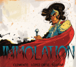
The first thing I want to know is who’s drawing the story! Even if I don’t have a script yet, I want to know what the quality of their line is, or how aggressive or soft their style is, because then I can go about adapting my letters to the feel of the comic. With Immolation, the first of Zach’s sci-fi vignette minis, I looked at Ricardo’s sharp, energetic style and thought that the letters themselves should retain some of that aggression.

From there I developed from scratch a lettering style I could adapt to the rest of the comics in that same series. I had to do this development on paper because I’m not deft enough with a tablet to be creative with it. This is where my calligraphy training comes in, and I have stacks of paper of practice for these letter forms. When I was doing research I often wondered why comics lettering often had very similar forms for some glyphs, like G’s or S’s or question marks. Through that initial practice and exploration I learned that those forms were really the fastest and clearest way to write a letter. The final lettering for Immolation was all done on paper, and then I placed the lines and drew narration boxes in Photoshop. I got this kind of roundabout lettering process from some posts that Emily Carroll did about her own gorgeous lettering. I can be kind of a stickler about process; I want to find a faster way to do this, but never discount any way you can get something done.

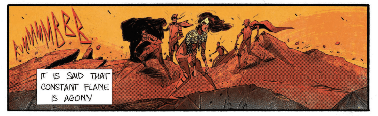
Next I like to consider each character and what kind of speech bubble they would have. My go-to speech bubble inspiration is Miyazaki’s manga, which are pretty loose and tend to subtly or not so subtly change shape depending on the emotion of the speaker. Though I favour irregular bubbles, in Remnants I wanted to contrast the Old Man’s hard edged speech with everyone else, so they got normal-ish round bubbles. Placing bubbles is the hardest part, I always vacillate between having dialog get seen in the right order vs. getting totally in the way of the art. That’s the bit where I can feel like an interloper, even though I’m delivering the story along with the art.


This latest one I’m doing with Zach has been the most fun because I went all-out for the voice of a powerful cosmic entity, and of everything I’ve done that’s been the most calligraphy-like and has the most presence on the page. Ordinarily I don’t want to stand out that much; I want the letters to retain as much of the spirit of the artist as possible.
Do you consider what it might be like to work directly with the artist/s creating the page layouts and drawing in the details? To be able to place words on the page as the page is made — not having to “cover up” the imagery with your speech bubbles or captions, but explicitly working together to make a page flow, words and pictures, together? To have the authority to prioritise typography in the creation of the visual creation. Would that change comics, do you think, if that became a norm?
There are some team books which have a strong design sense built in to the comic from the start. Like The Wicked and the Divine, or Fraction’s Hawkeye, both of which I love the look of. The trouble with those examples, though, and other books like East of West, is that I’m not sure “design” in the sense of what people would take for well-designed, with its whitespace, Helvetica or other “refined” sans-serif, muted colors etc, is the right fit for most comics. I have a perhaps not uncommon problem of appreciating minimalism while not practicing it in my life. Each time I’ve done a title it’s been crazier than the last one. I like playing with shapes, and I would hate for comics creators to look at The Wicked and the Divine and think we need a sans-serif title and we’re done. It’s possible to do so many weird things with words in comics I would love to see more of it. When I first started doing these minicomics, I wanted to do the sound effects because you can always get crazy with those, but I ended up giving that to the artist so that the sfx would be better integrated into the comic.

I’m not sure what a comic would look like that took the presence of words more as a visual opportunity than merely a necessity. I keep thinking about Mirror, Hwei Lim and Emma Rios’s comic, where the two of them bounce off each other and combine in such a beautiful way. Hwei does the lettering and the whole comic has such a smooth flow; I’m not sure I can pin the effect to just one of them. Zach gives me the opportunity to do my own thing in my painstaking way by writing very quiet comics with bits of staccato narration or dialog. In that sense it’s more of a collaboration than I think occurs between many letterers and writers.
