
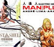
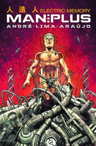
 MAN PLUS

Titan Comics, July 8th
André Lima Araújo, Arisa Rozegar, Luis Guerrero, Tom Williams
Ghost in the Shell lifers J. A. Micheline and Claire Napier (that’s me!) discuss what was the first issue, but has since become just a section of Titan’s ongoing web release, of André Lima Araújo’s passion project Man Plus. Do they like it? Find out:
Claire: This first question is always the first question: Did you like it?
JAM: Yeah, I think so! It’s always so hard to tell with first issues and this one is largely set-up, but I think I’m into it. It’s ringing a lot of old and well loved bells for me, particularly the most important one: Ghost in the Shell by Masamune Shirow.
Claire: Yeah. Let’s talk about the available comparisons there and get them out of the way! Because, obviously there’s the whole “cyborgs” thing. And the dead guy with Batou eyes (which, I’ll confess it, was the deciding factor for my downloading this preview). But there’s also something in the linework, don’t you think? Something of Shirow’s draughtsmanship techniques, in the buildings especially. The very fine lines, the padded corners?

JAM: The linework definitely is calling back to it, but I think it’s actual elements of the world that are doing it for me too. Stuff that’s not necessarily Shirow™ but still is concretely part of that setting enough to make it familiar – I’m thinking of Josu’s cybernetic implants (which I’m sure I’ve seen either The Major or someone else with) and also the way they actually connect wires to cyborgs/machines to obtain information.
Claire: Those big rounded goggles with the three little circles in the corners?
JAM: Those’d be the ones.
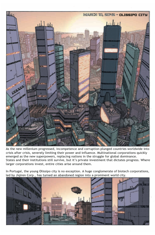
Claire: She’s definitely worn those, yeah. Also actually the initial page of “here is a city, and now I, the creator, will talk to you about background details that either the plot will explain on its own, or which you wont need to know to enjoy the story” was very Shirowish. Not in an accusatory way… this was pretty reserved, in comparison. Just familiar and sort of nostalgic. Like, I know this place.
JAM: Absolutely. It’s really weird, because I’m normally very sensitive to…knock-off, sort of things, if you will, but MAN PLUS doesn’t feel like that at all. André Lima Araújo has somehow managed to pull off this homage/nostalgia sort of thing where I’m perfectly fine with the fact that it’s borrowing a lot of elements from other stuff. In fact, it kind of feels like this could be a different period in the GitS universe, or be happening at the same time stuff is happening in Japan — just in Portugal.
Claire: Definitely. Actually I think for me, the most remarkable thing about the story at this early point is that as a reader I deeply recognise that it’s NOT happening in Japan. I don’t know if it’s body language, or lack of iconography, or all the blondes, or something subtler, but it’s fascinating to me and… almost a relief. A cyberpunk story that doesn’t want to suck on the teat of Orientalism??
JAM: I think I’m less convinced of that. Maybe because I was already put off by the fact that, despite being set in Portugal, we still had some Chinese characters printed on things and Chinese companies early on. Obviously Japan & China aren’t the same, but it still had a similar enough connection/feel that Western stories seem to have to take on whenever they venture into the future. I don’t particularly feel like it’s happening in Japan, sure. But I think if you changed all the names to Japanese things, I would.
Claire: I guess that China doesn’t tend to feature in cyberpunk canon in quite the same way in my experience — to be frank, my experience with fiction in this vein, and stereotype in general (a form of fiction), is that Japan is written as aspirational, whereas China or the rest of Asia is written as the opposite: not advanced by its own labour, not monied, not technologically adept — not legitimised by the narrative, the opposite of here, which makes enough of a difference for MAN PLUS not to feel old hat. I can’t be sure I’d not accept it for Japan if the names were changed, I guess, but on the other hand: they aren’t.

Having said how much Man Plus does and doesn’t remind me of past works, what did you think of the lettering? It looks sort of odd to me, like it doesn’t quite gel somehow, but that gives it a scanlated vibe that I shouldn’t enjoy but do.
JAM: You know, I was absolutely wondering about that. Because it does look like it was put on after the fact — which is maybe also why it’s ringing old bells — but I was wondering if the comic was originally written in one language and then translated by someone else. I think it’d be fine for a scanlation, but I don’t think it looks professional … because it looks like a scanlation. I also had some problems with some early panels where the lettering was really tiny. The dialogue wasn’t crucial (and I was able to zoom in) but there was plenty of room on the page for the speech bubble, so, why the tiny words? And if it’s to indicate whispers or some difficulty of hearing, is that fine?

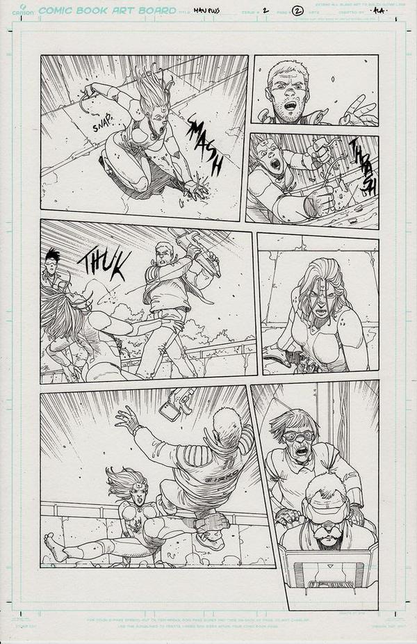
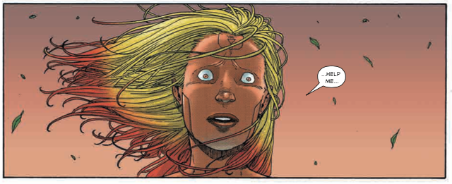
Claire: Looking more closely at the speech bubbles now, I think that what’s making them look strange to us is that they’re very cramped. Usually there’d be a much larger margin around the words (especially in manga). I wonder if it’s the letterer not wanting to hide too much of the detailed panels? I can understand the urge to let the detail shine, but I think bigger bubbles (even by a smidgen) would improve things markedly. The very tiny bubbles in the earlier panels being really wee, I’m torn on that — it does make them hard to read, but it is also very atmospheric. The android is all fucked up and can’t hear or focus properly; it did help me to engage with her experience of the scene, to have physical empathy with her, which is QUITE the feat, as she is robo. That’s something that left a lasting affect on me, actually, that her appearances on the page are all, for want of a more mechanical word, so visceral. She really emotes.
JAM: The image logic isn’t quite right though, is it? She’s having difficulty focusing, but the speech bubbles and their contents are always crystal clear — they’re just small. There’s a good job done by making the people very fuzzy and out of focus, but I would have opted for normal-sized words with disjointed/confusing speech. Making the words tiny but clear doesn’t really convey what (I think) is happening, at least not in the way that putting people out of focus did.
Claire: I don’t know, I think it worked for me. There’s a type of headache where it’s not that you can’t tell what people are saying, it’s just that you have to hyper-focus on the fact that they are saying it, even though you don’t care? This, again, is very subjective.
JAM: Fair dues. What do you think about how much the story progressed within the first issue? This is part 1 of 4, but were you expecting more? Less? Or was this just the right amount?
Claire: I’m feeling rather tragic about there being only four. You?
JAM: Same, yeah. At least each of the 4 is going to move about as much as this one did. I kind of feel like this deserves more time, but maybe that’s because I’ve been spoiled by manga. I almost want to read a graphic novel version of this (that is to say, one long extended thing) rather than one that’s done in installments.
Claire: Me too! It feels wrong to expect anything less than a nice fat all-in-one volume. But if we can’t have it, we can’t have it. How do you like the colouring? I have regularly complained about comics that use grey as their basis and gently tweak it into faded mould tones, but here I honestly love it. I DO NOT want to see it printed on glossy paper. Newsprint, matte paper, or screen only, I think.
JAM: Yeah, it’s all contributing to that nostalgia feel that’s absolutely perfect. I’m also super into our rogue android’s hair style? And her body shape! There was obviously an opportunity here to make her incredibly svelte, when she’s actually built like goddamn tank.
Claire: YES! Let’s talk about bodies! I also really appreciate that she’s solid. A strong waist! And the layout of her face echoes the build of her body; she looks very harmonious, nothing obviously sacrificed to make her look over-marketable, you know?
JAM: Absolutely. She has a body type that I see on women walking on the high street which, I think, is the first thing we’ve discussed so far that isn’t Shirow-like. I’m wondering if that should key us in to the android’s purpose, if she looks less marketable? I hate saying that though.
Claire: She’s definitely not a production-line sexbot, as she has no holes (beyond the one in her stomach, which is clearly not in the specs). I know that André Lima Araújo is a trained architect, and I wonder how much that material experience changes the method of illustration between drawing a human and drawing a robot or cyborg? Did he set out to draw an architecturally reasonable android woman, or is the design based more in the secret of her origin, like you say? Or both? I am excited to find out.
It does strike me that the “bad guy team” is far more observably cyberised/inhuman. Is that an active, philosophical choice, or a Disney-style Evil Looks Evil thing? Their captured technician looks fully human, and he definitely doesn’t feel at home with them. They clearly alarm him.
JAM: Yeah, it’s interesting, because they’re not just cyberised, but most of them are also cybernetic in a way that doesn’t in any way mimic the human form — inhuman, like you said. I think I’d err on the Evil Looks Evil-side, if anything, because there’s just too much of a coincidence there. I read something interesting recently about how covering your mouth makes you appear threatening, but covering your eyes is more okay. So we have Josu, who has visual implants but smiles like the little Neo-Tokyo Cyclops he is. (Just kidding. Cyclops never smiles.) Versus the baddies who don’t emote at all, with the exception of their boss and the skinny guy who seems to have got in over his head.

Claire: The narrative does make a point of stopping to focus on how little tenderness they show their dead colleagues, though. That could just be more textbook evilness, but perhaps we’re shown how much of these people have been turned metallic because we’re supposed to recognise that they’ve “lost their humanity” with their biological physicality? There are regular views of the outsides of the buildings that these people operate from, and–back on the architecture track — ALA’s master thesis had a big focus on how buildings are technology. I haven’t done as much research on that point as I hope to, but the building they hole up in is very run down, the wires on the outside and inside are patchwork and drooping; it’s a crappy looking place. So maybe the book is picking up one of those classic cyborg threads: poor people can’t afford to “look human” when cybernetic limbs and mechanised bodywork is a regular part of life. Maybe that grinds people down or prevents bonds from forming. Maybe there’s a purposeful “dehumanisation” theme. That could go either way, into being really interesting and compassionate or being thrown in for flavour and turning out really gross, but we’ll have to wait and see.
JAM: It’s a lot of wait and see with this, though, isn’t it? On the one hand, I think I’m in the world and I see how it works and I’ve set up a conflict, but on the other, I do think that the world I’m in, I have filled in with past experience of the genre. That is to say, I don’t know how much of this comic I like because of what I’ve been given and how much I like because it’s ringing old bells. I don’t know what my reaction would be if this was my introduction to cyberpunk comics/storytelling.
Claire: I just noticed that the Police car they get out of in the last scene is a Shirow-brand car.
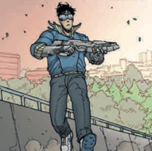
JAM: Ahahaha, you’re right! It is! I was looking for some Akira references myself. Something about Josu and Rodrigo’s outfits are calling to me, and it’s not just the red jacket.

Claire: Is it the blue jacket with the almost precisely identical cut to Kaneda’s? But ~references aside~ (impossible), how good is the fashion in this? My opinion is: so good. It’s retro futuristic in ways that haven’t actually happened yet, in real-world fashion era re-visitations. Familiar enough to look reasonable but imaginative enough to look genuine. It’s not fancy. It’s got those ’80s – ’90s callback details, but it doesn’t martyr itself to them. Elsa Carvalho’s bizarre suit is AMAZING. Everybody has those 1989-does-2015 Nikes. I love it.
JAM: Yeah, I mean, it’s all callbacks. (And again, this is all in a good way.) I dig the retro-futuristic ’80s – ’90s schtick, but — and I feel like a squeaky wheel here – is this going to work for someone new to these aesthetics? And does ALA have a duty to stick his neck out a little more and do something different? I’m well happy to read a Ghost in the Shell AU in Portugal with androids that have better body types, but am I reacting to the work as it stands or am I fitting it into another universe — and does that matter? It’s really hanging me up that I can’t look at this without comparing it to other things pretty much automatically. I’m trying to come up with something that’s unique about it, beyond the body types, and I can’t.
Claire: I can: fucking weird-ass robot self-disembowlment.
But to address your greater point: will it appeal to somebody new to the subgenre? On the one hand, I don’t know, and on the other (bear with me) I don’t care. I LIKE IT! ME, ME, ME! Seriously though, I think that this comic is lucky to be publishing right now: this aesthetic is in vogue. We’re living in the ’90s-are-retro times, right now. And Shirow’s been influential enough in the wider pop cultural scene that I find it really hard to imagine that a new reader would find anything entirely opaque. People get robots. Will Smith has fought robots who think they’re people.
And I don’t think it’s an insular comic. I think that enough time is taken with establishing shots, wide spreads, and pauses on exactly what happens in the people’s jobs that if it’s new to somebody, it’ll seem like this comic is inventing it. I actually think that anybody who doesn’t get the references is lucky, because this has everything you and I already love- but with way more women, with much wider bodies.
JAM: Yeah, in the end, I like it and I guess that’s all that matters. I will learn to worry less and accept my love more. So how else would we like to see this evolve, then? ALA has already addressed something critical by introducing more women with more varied (and also not sexualised — look at how the breasts are drawn on our rogue android! No cleavage! It’s a godsend!) but what do you think could make it really come into its own?
Claire: Oh, I’m a simple soul with simple needs. All I want is a tight police procedural with genuine and complete philosophical ponderances on the nature of sapient existence, all in great clothes. Do you think it can do it? Or are you easier to please?
JAM: No, that’s about the measure of what I’m looking for. Except maybe with a little more skin tone variation too. That would more solidly un-Japan it for me. Oh, and if someone randomly ghost hacked someone else, I wouldn’t be mad.
Claire: Well not-Batou is already dead, so nobody can hack his eyes.

I really hope (and it seems to be on the cards, having read around) that we get some real personal establishment from the great big lady who leads the Bad Team. She vaguely reminds me of Bai Ya Shan from Crying Freeman, which is literally only because they are both tall and wide. But that is thanks to how bloody rare a truly large woman (and a large woman who doesn’t apologise for her space-related needs, even better) is in visual fiction. I am a small woman, but I desperately want to be able to feel like that’s simply down to genetic fate — not somehow a way in which I am a good and obedient female. Sizeable, competent women I can see, in stories (or anywhere), fill a hole for me. So, fingers crossed.
JAM: I would also like to see Ana and Liu a little more front and centre. Or at least in on the jokes sometimes. Josu is precious and Roderigo is great dad material, but I’d like the women to either have their own demonstrated circle of enjoyment or for everyone to play together.
Claire: Seconded! But hey, I know why you remember Josu’s name no problem. Josu is totally the Togusa.
JAM: Is he? Togusa is the guy just trying to get along and be normal while everyone else has the occasional laugh at his expense. I feel like Roderigo is probably him and then Josu is like a young, even more chilled out Batou. Or maybe Saito if Saito were the chatty type.
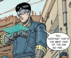
Claire: Look at him run on the second-last page. So flustered! So Togusa.
Ughhhhh! I love this type of story world so mu-hu-huch!
JAM: Oh wait, oh my god, he’s Dick Grayson in the Ghost in the Shell universe. That’s who he is. And also yeah, me (fucking) too. All the things I like are all here. Once we start getting into what it means to be human versus cyborg I’m probably going to lose it. That’s coming, right, ALA? Right???
Claire: I am seriously so excited and hopeful. DONT LET US DOWN, ANDRE.
