
The ABC of Typography
Seyhan Argun, Aseyn, François Ayroles, Hervé Bourhis, Alexandre Clérisse, Olivier Deloye Libon, Delphine Panique, Jake Raynal, Anne Simon, and Singeon (illustrators), Edward Gauvin (translator), David Rault (writer)
SelfMadeHero
September 12, 2019
From its title The ABC of Typography may seem like it would be for toddlers, but it actually offers a chronological history of typography for interested adults, in which the author David Rault has worked with a different comics illustrator for each chapter. Each era of the evolution of typography is thus given a unique flavor by the different art and lettering style and the reading experience stays fresh and interesting throughout.
To help me review this book, I called on Lisa Aurigemma, Associate Art Director at Wine Spectator, and reviewer of Pressing on: The Letterpress Movie for our sister site, Ms En Scene, to read it and discuss it with me because she is the typographiest person I know. We had a lovely conversation about it, and Lisa ended our conversation by saying “I definitely want to buy this now,” which is a pretty ringing endorsement.
Lisa felt that The ABC of Typography was really fun, and it offered “a nice walk-through of the overall history of written and then machined letters.” While unavoidably “some of the illustrators handled the material better than others,” the book is able to offer a coherent introduction to the material because the graphic narrative format of delivery can indulge in “nice little details without getting too bogged down” in definitions and explanation.

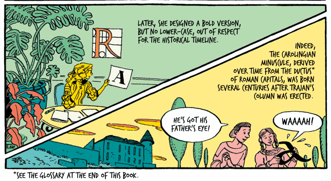
Lisa’s favorite chapter was “Chapter 5: From Humanist to Didone,” illustrated by Delphine Panique, because it offered so many of those little details, such as having the page about the printer Aldus Manutius (who is known for inventing italics) present all of its panels with slanted outlines. Lisa called this, “the most graphic designer-y of the chapters,” and her expertise as a graphic designer is so different from my own as an English professor, it shed light on the range of ways this book can appeal to different readers.

While most of the chapters covered historical overviews of entire eras or movements, my favorite was the one about Gutenberg. Lisa noted that compared to all the others, “the Gutenberg chapter is like this little spotlight” on an individual person. It tells a story of human individuals that has a beginning, middle and end, and reader: that is what I like. Compared to how narrative this chapter was, the rest of the book felt like its pages were laid out like a textbook’s: informative, but not as cohesively engaging. In fact Lisa approvingly described it as “pretty solidly almost the syllabus of a Typography 101 course.” Throughout the whole book, there’s very little dialogue and the art doesn’t move the plot (as I tend to expect in more narrative comics) so much as illustrate the concepts in the writing.
It does a good job at being an introductory textbook, and Lisa’s appreciation of it was illuminating for me. We did share a least favorite chapter, however, as the chapter about the Dark Ages engaged in far too much historical handwaving for either of our tastes, presenting “barbarians” who “don’t care” about culture. As Lisa put it, “I was so exasperated by that stereotype and it is even more annoying to see it repeated. Even in this context where yes, there was a literal threat to written language at that time, but boy was there a lot more nuance to what was going there!”
Nuance, however, wasn’t ever the point of The ABC of Typography, which clearly lays out the parameters of its subject matter quite narrowly. In its visual medium, it also, of course, draws attention to the optics of some issues with the current discipline of professional typography, highlighting jut how overwhelmingly white, and how nigh-overwhelmingly male, the field still is.
Lisa summed up the appeal of Rault’s book by noting:
It’s exciting to see books like this because they help bring this history to life in a really appealing and accessible way. Fonts are a part of our daily lives whether we notice them or not. We interact with fonts constantly in everything we read on screens and in print. And making typographic choices is now no longer purely the domain of professional typesetters and designers. We all scroll through fonts in long menu lists on our computers, knowing that we like some fonts more than others or that some seem to work better in certain contexts, and it’s nice to see a book that sheds light on the history and resonance of that font menu without feeling like a classroom.
Rault states in his Introduction: “I know for a fact that there were no comics about typography. So I had an idea: to write the first-ever graphic history of Latin type, and in so doing make fundamental knowledge about a humongous swath of Western culture available to new audiences.” I hope this introductory book, with its innovative approach to illustrating the history, will help widen access to that field.
