
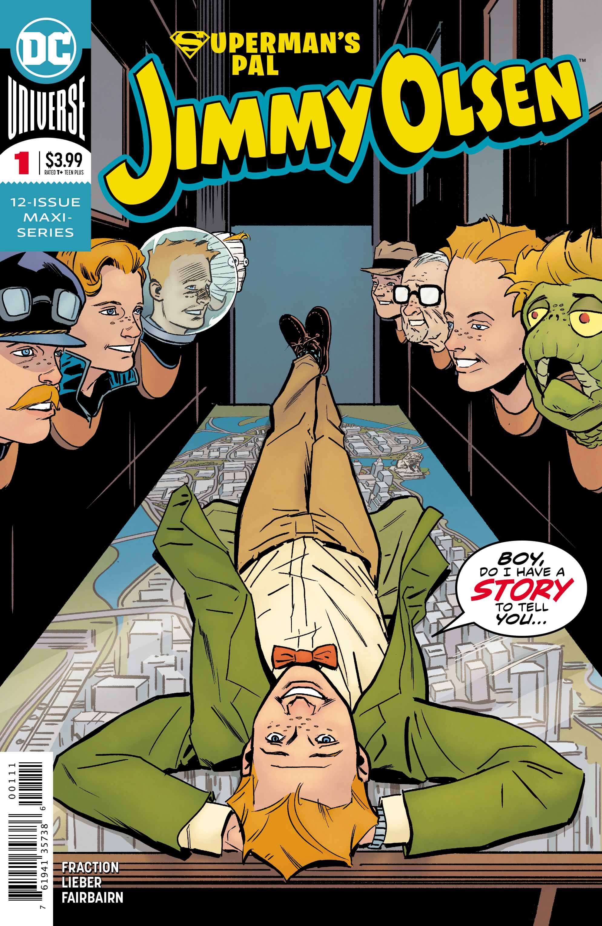
Superman’s Pal Jimmy Olsen #1
Clayton Cowles (letters), Nathan Fairbairn (colors and cover), Matt Fraction (writer), Steve Lieber (art and cover)
DC Comics
July 17, 2019
When Superman’s Pal Jimmy Olsen was announced several months ago, it immediately became my most highly anticipated book of the year, and indeed of many years. I’m not the world’s biggest Jimmy Olsen fan per se—I like him, but he’s not my favorite person in Superman’s supporting cast. However, Matt Fraction and Steve Lieber are two of comics’ best humorists, and are both the absolute perfect fit for this comic.
The most interesting and funnest thing about Superman’s Pal Jimmy Olsen is that it reads very much like a series of newspaper strips. In fact, the issue is broken into four smaller stories, and all of them feel like they could be a week’s worth of strips. There’s a story about Jimmy’s ancestor Joachim, a brilliantly funny reintroduction of Turtle Boy to comics, a story in the newsroom of the Daily Planet, and lastly Jimmy in a Gotham no-tell motel. Each of these vignettes could be read on their own, but they all tie back into the main plot of the book as well.
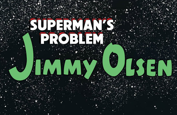
Fraction’s pacing is spot-on in this book, and the comedic asides to introduce each chapter are brilliant. (My favorite is ‘Superman’s Problem Jimmy Olsen.’) Also fantastic is the dialogue, the best example of which is the conversation between Jimmy and the motel owner, with window bats, coitons, and advice not to get moidered. It’s very much a Matt Fraction comic, but it is also intrinsically a DC comic, which makes it all the more crazy that Fraction is being allowed to get away with everything he is.
Equally important to the humor of this book is Steve Lieber’s art. Like Fraction, Lieber has long been known for his comedic timing, and as a pair the two shine. The best are Lieber’s facial expressions. Whether it’s Clark’s exasperation at Jimmy’s latest predicament or Perry’s rage-filled screaming, all of the characters in the book have immense personality. The script and art combination also flow really well, and make the book a very quick read.

Underappreciated are both Nathan Fairbairn’s colors and Clayton Cowles’ letters. Fairbairn’s palette for the book does as much to evoke the feeling of Sunday morning comics as the lineart and writing do. The colors pop, and make me harken to days spent reading Calvin & Hobbes at my father’s house. Cowles’ letters, especially his brilliant sound effects and the amazing titles in each story, also bring a sense of fun to the book. Another inspired choice was enclosing each story’s final word within Jimmy’s famous bowtie.
With one issue, Fraction, Lieber, Fairbairn, and Cowles have reignited the wackiness of the Silver Age in a way that works with modern comics. They’ve brought back Turtle Boy and Jimmy’s gorilla wedding, and made the funnest book I’ve read in a long time. My only complaint is that I have to wait another month for more.
