

Critics have referred to variant covers as one of the scourges of the direct market comics industry, and they may have a point. Variant covers became popular in the 1990s when comics publishers sold them to speculators in order to increase sales numbers. Eventually, when the fad of buying comics passed, the market crashed. Now variant covers are still commonplace, and some would say that they only exist to inflate sales numbers or take advantage of completionists.
However, variant covers can also be for art lovers, and they’re far more accessible and cheaper than prints. They also still make a great marketing tool, one that comics publishers greatly recognise. Just check out how cover artists are paid per cover in comparison to interior artists’ rates per page. Although we’re long past the era where Superman comics covers lured young readers through the famous superhero’s bizarre actions, publishers and creative teams employ other strategies in order to make higher sales.
When it comes to The Wicked + the Divine by Kieron Gillen, Jamie McKelvie, Matt Wilson, and Clayton Cowles, that strategy seems to be to scoop up as much of the deep comics talent pool as possible in order to make the series variant covers worthwhile. Just check out Jock’s variant cover of The Morrigan for The Wicked + the Divine #28.
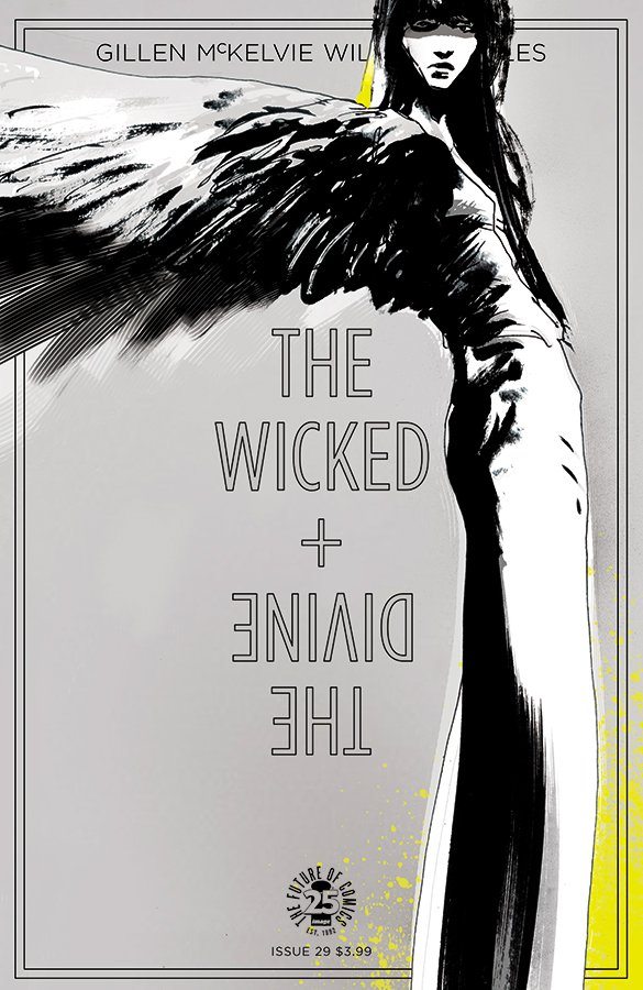
Jock’s work always hits a dark note perfect for certain gothic, noir, or horror comics. In this cover specifically, he uses the tall build of The Morrigan’s figure in order to both frame the cover’s title logo and creates an intimidating presence on the page. Her willowy form seems ghostly, almost monstrous in its intentionally too-long legs and slightly leaning posture. Jock’s masterful use of shadows curves her body just right, casts a darkness over her eyes that sends a malevolent glare, and creates a texture over the ends of her feathers that makes them actually appear feathery. She’s a frightening, but alluring presence and there is something so poignant about the cover’s aesthetic that one can’t help but want to find her story within the pages.
The thing about The Wicked + the Divine is that its covers are not only tantalizing, they’re fitting. Marketing and image (Isn’t it so appropriate that this title is published through Image Comics?) makes up the book’s core and its variants exceed nearly every if not all other series’ in quality. The cover artists who Gillen, McKelvie, and Wilson grab are not only all incredibly talented, they’re diverse. The story may not interest you, but not a single person wouldn’t find something visually appealing within it.
The Morrigan owns a gothic aesthetic, which is distinct, but not narrow. Chynna Clugston-Flores makes her the subject of her variant cover for #27, which was the series’ International Women’s Month cover. One might assume that for an aesthetic like Morrigan, a shadowy angle like Jock’s would be most appropriate. Instead, Clugston-Flores creates something glamorous out of a much simpler approach.

Clugston-Flores, as opposed to Jock, uses very light inks. From the webbing on Morrigan’s skirt to the clean outlines of her birds, Clugston-Flores evokes something more on the cartoony end of the stylistic spectrum. The black makeup across Morrigan’s eyes doesn’t create the evil aura that Jock’s does, mostly due to the contrast in her light eyes. Behind the logo instead of framing it, Morrigan’s arms are spread in order to take up space and therefore imply a powerful presence. This is helped through the careful positioning of her ring and pinky fingers tucked into her palm in order to create a sense of magic.
Although Jock and Clugston-Flores use the same character, their individual styles make her distinct in two completely different ways. This, in turn, positions the character with more than one kind of beckoning that allows the covers to reach a larger audience. Do you like goth girls? How about Addams Family cartoon-like goth girls? How about women in white goth girls? Either way, WicDiv’s got your goth girl, right here.
(And just like with those tricksy Silver Age Superman covers, it’s kind of a bait and switch where, with McKelvie’s style, you’re getting a third goth girl approach instead. Hope you like rockstar goth girl!)
So while one has a good foundation to argue how variant covers inflate comics sales to misleading numbers, Gillen, McKelvie, and Wilson prove that they can serve a different purpose. WicDiv covers celebrate art, both with the well-known artists in the industry and newer artists who they can help promote. And we have to ask: is it really an inflation in numbers when readers genuinely want several beautiful pieces of artwork instead of just one?

