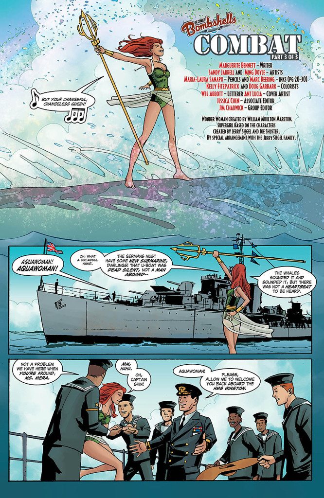
Kelly Fitzpatrick has done work for quite an extensive list of books in the three years she has been coloring. She is currently known for her work on Snowfall, Peter Panzerfaust, and Bitch Planet. You can find her work here, and follow her on twitter here.
Can you talk to us a little about your education as an illustrator? Why did you choose illustration? What drew you to your school?
How do you think your education as an illustrator has informed your work as a colorist?
Absolutely! It’s definitely shaped my visual aesthetic. The knowledge of golden age illustration, art nouveau, and art deco I think has attributed to my color language.
Who are some of your favorite painters?
I love the impressionists (Van Gogh, Monet, etc.), as well a bunch of classic American illustrators (Leyendecker, C Coles Phillips, Tenniel, Wyeth, etc.), Sargent, Hopper, Audubon, Aivazovsky, Art Nouveau painters (Beardsley, Mucha, etc.).
In the past you have mentioned you worked in fabric design before you made your way to comics. How do you think your work as a fabric designer informed your work as a colorist?
I think it’s just another part of my visual toolbox, just like photography. It’s helped, I suppose, in understanding tone and what is appropriate for different audiences. I used to make patterns for children’s fabric. I would use very bright, saturated colors, which are appropriate for that particular subject matter, but I would never use those colors for coloring crime, noir books for example.


A lot of your books feature strong yellows, I’d go so far as to call yellow impact panels a signature of yours. Can you tell us a little about your use of yellow?
I feel that red, yellow, and blue are your strongest color choices for having the most emotional impact. I tend to use red for violence or power, yellow for action sequences and blue for sad, more emotional scenes. These colors are really good to add in emotional beats to break up panels visually for the reader.


Can you tell us a little about your work with artist Sandy Jarrell on Sensation Comics Featuring Wonder Woman? What was your collaborative process like?
With my DC books, I tend to have a little less communication with the creative teams, as most of my emails go directly through my editors and the editors relay messages out to everyone else. Sandy and I closely worked together (a lot of emails back and forth) and had awesome talks about Bilibin and Russian illustration! We wanted the flashbacks to have a classic illustration vibe. It was great and I’m really proud of the outcome.

How do you think about night scenes?
The same way I think about any scene!


What do you do when you get stuck?
I look at how other color artists have approached the same subject matter before me and take from their palettes what I think is working from it and add it to mine. Sometimes looking at other’s work is amazing for inspiration and seeing things in a different light.
Do you have any palettes you find yourself returning to?
I try to make each book have a specific tone and palette, but I know since things are inherently made with my hands and my brain that there will be some overlap. I use different brushes and textures for each book as well.
You use the brushes in different modes. Can you speak to the advantages of that at all?
I use brushes often in multiply, screen, and lighten to blend different colors just like you would with paint. I think this comes from having a traditional illustration background.
Do you build your own brushes or do you use Kyle Webster’s Photoshop brushes?
I use various brushes I find online that are free to use for mass publication as well as Kyle’s glorious brushes! I do tend to tweak Kyle’s quite a bit but his brushes are hands down the best I’ve found.
Do you have a flatter you love to work with? Do you want to tell us their name or are they your secret ally you need to keep to yourself?
Fernando [Argüello]! He’s the best. I’m sure Tamra [Bonvillain] can agree. I’ve been working with him for a couple years now and feel very lucky that he puts up with me. I’ve also got a new assistant, Corrie Walton who is pretty great!
Who has given you the best portfolio review?
Declan [Shalvey] and Jordie [Bellaire] have probably given me the best portfolio review. Dave Stewart’s review made me cry though. He was very kind and very supportive and that’s why I cried afterwards. It was shortly after I had started coloring full time and was very validating for me to hear from someone I admire that my work was good and I was on the right track. Ha ha. I can be such a weenie.
What are some of your favorite magical girl comics?
I love Full Moon wo Sagashite, Card Captor Sakura, Corrector Yui, Princess Knight, Princess Tutu, and Magic Knight Rayearth, with my gateway drugs being Sailor Moon and Utena! My real love is Rose of Versailles which inspired a bunch of magical girl content as well. Oscar is my role model.
What is your work routine like?
My typical day is: getting up before 9AM, drinking coffee and having breakfast while reading and responding to emails and watching a TV show, reading scripts and setting up pages, color correcting my pages and then eating lunch, and then coloring 4-5 pages daily. In between all of this I’m drinking tea and trying to take little breaks. I’m working towards having weekends off and exercising again, but it’s difficult.
How do you manage your time?
I stick to schedules and routines by keeping very specific iCal notes stating which book to work on each day — calculating out my average page count for each book. iCal has all of my book information, my due dates, birthdays, events, appointments, and trips on there to keep me in check. I live off of my calendar. I also have a printed voucher system and a physical calendar to keep track of paychecks, business expenses, and tax and medical information. I’ve slowly been refining a system and it’s still not perfect, but it’s manageable. I also have a flatter payment Word document and an income expense Excel document that I fill out monthly.


