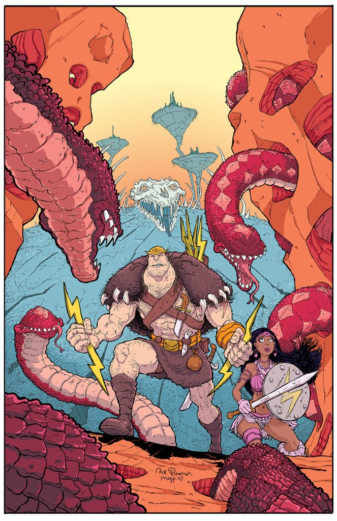
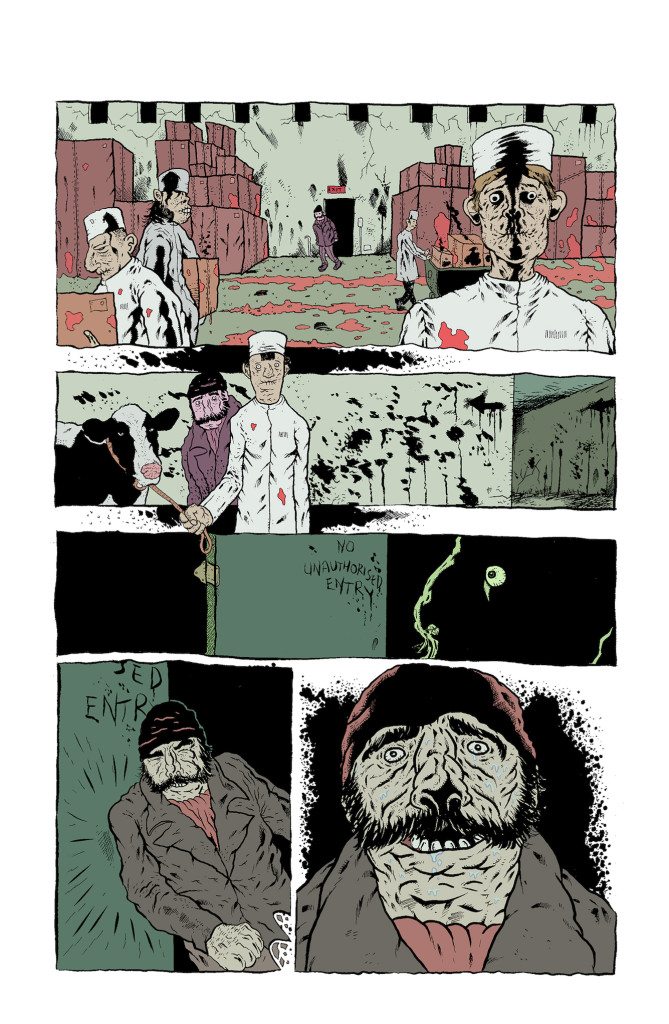
Hello, and welcome to another interview! This time I had the pleasure to chat with Megan Wilson. You know her work from Hellcat, Then Emily Was Gone, and lots of covers with Nick Pitarra. She’s a real kick in the boot. You can follow her on Twitter @MeganEngiNerd or peep her great Instagram.
You use a wonderful variety of greens. How do you think about green? How do you create enough contrast in your greens? How do you develop your greens for your palettes? What draws you to green?
Thank you! Do I use an abnormal amount of green?! Greens feel really versatile to me since they can kind of be tricked into either feeling warm or cool. In terms of process, nothing comes to mind that I do different specifically for greens. I try to use a wide enough range in value to help with visual clarity. Additionally, for palettes that use a lot of colors that are similar in hue, I try to stretch them across at least two neighboring sections of the color wheel. I think this gives it a feeling of still being in the same general family, but adds interest and further helps with clarity.
Some of our reader’s are new to color theory. Can you talk a little more about the range of greens? Or how you trick them?
Ha! I can try, but I’m probably the worst person to try to this! I made a terrible example, but maybe it helps a little bit? The black boxes are examples of ranges I might try to stretch across, sometimes wider, sometimes less. When you factor the differences in value and saturation you can apply across any one of those ranges, you end up with quite a large range to work with.
If you look at that little green stripe at the bottom of the blue-green-yellow gradient, the left side should read as slightly warmer and the right side as slightly cooler, even though it is the same green all the way across. Definitely not the most clear example ever, and it is probably hard to see, but it was quick, so, oh well. The point is, colors will change their behavior depending on what you surround them with. This is true not just for hues, but for value and saturation too. Neat trick, huh?!
The two squares at the bottom show approximate midpoints that I grabbed between blue-green + green and green + yellow-green. When you look at each point (circled) in the gradient at the top, they both still look similar to the green at the center (next to the white gap), and not hugely different from each other. However, removed from their surroundings and placed on white, you can more clearly see difference. If you drop these into an entirely new context, i.e. a full palette/scene, there’s a chance one will work much better than the other, or maybe they will both work, but in completely different ways, depending on what else is in the palette.

One great example of your green use and humor is the scene in Patsy Walker Hellcat Issue #2 where you chose to make the pillars green to emulate Super Mario Brothers. Do you hope that people catch these Easter Eggs, or are they just for you? How often do you include them?
That was just for me! I actually thought there was a good chance it would get edited out, making it a potentially self-defeating thing to do because I probably would have ended up redoing the whole scene, since the entire palette was based around making that joke. Of course, I did it anyway and just didn’t draw any attention to it when I turned the pages in, ha! Sorry team! I think that might be the only Easter Egg I’ve done; I should start doing more of them!
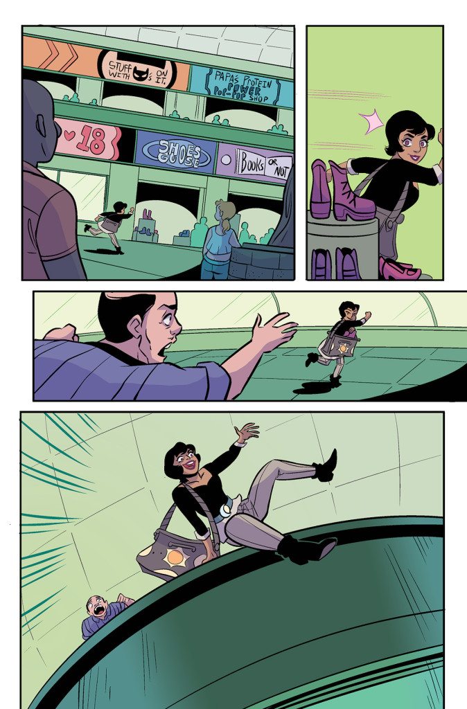
Sometimes you use shadows to create a vignette effect. How do you choose when to do those?
This was subconscious, but now that you pointed it out, I might start doing it intentionally, so thanks! I suspect it was a a side effect of me knowing I wanted to frame and draw attention to what was going on in the background while I was rending the foreground.
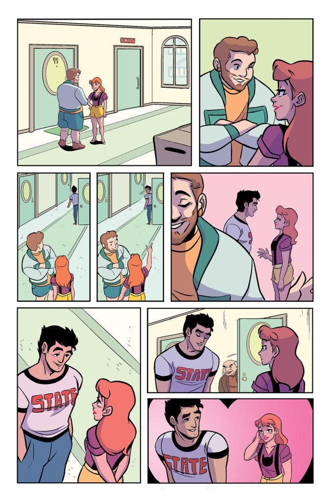
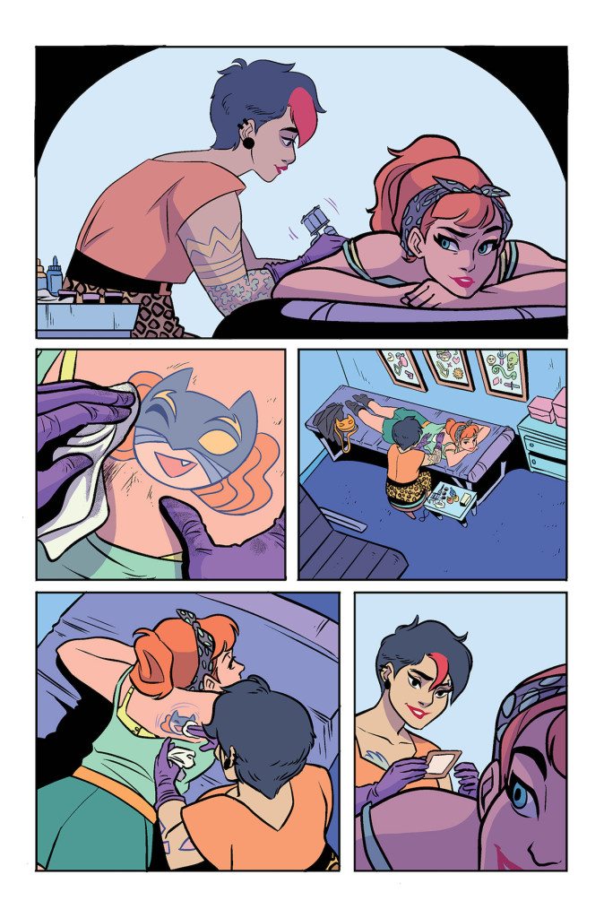
Night scenes are complicated! It’s our regular question to ask colorists how they like to think about night scenes. What is your process?
They are tricky! I’m definitely not super literal when it comes to color, so that gives me a lot of options. Typically, the first thing I’ll do is shift everything toward cooler hues and then adjust value and saturation depending on mood. Then, at least in the case of Hellcat, if it’s supposed to be energetic I’ve been tending to go somewhat heavier with a bump in saturation, whereas if it’s restful I’ll lean a bit more toward pastels.
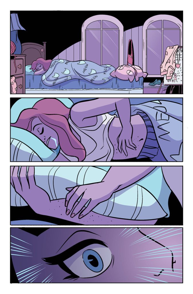
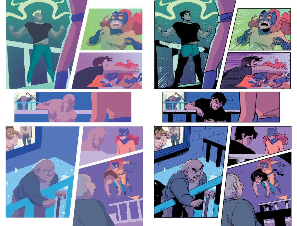
How do you tell story with your coloring?
In the most basic sense, I try to enhance the storytelling by making pages interesting and clear when the line art is hidden. There are a bunch of things I think about at this point. From the more technical side: Is there a distinction between foreground and background, and which is more important? When there is a lot of non-essential stuff going on, is it clear what the important things are? And then for the fun side: Does it have the right vibe for what’s going on in the story? I try to make sure things read properly without using the line art as a crutch, while also trying to not detract from or overpower the line art itself.
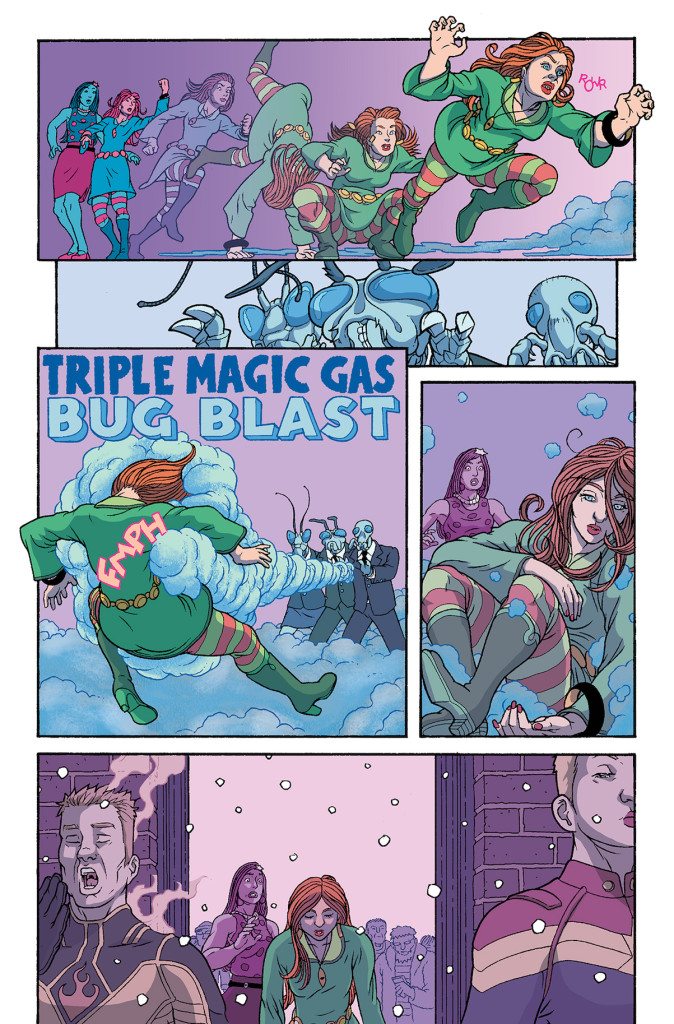
And again, since I’m not literal about it, sometimes I’ll try some weird stuff. I’ll use a page from Gwenpool Holiday Special as an example. This takes place at a Christmas party, and the lovely lady in the polka dots is She Hulk; nowhere on the page is she actually green, but I did use green elsewhere on the page. What’s going on here is Jen and Patsy Walker are trying to keep this party going as a means to defeat the bad guys, whose super power is essentially blasting people with gas to turn them into party-poopers. So, on the left side of the first panel, Jen and Patsy are bright teal and pink, because why not; it’s a party, right? Then Patsy transitions out of that into attack mode across the rest of that panel and stays like that until she gets blasted with gas. Finally, it becomes a bit more somber, because Patsy is now in party-pooper mode, and Jen is purple, because she’s essentially background. Jen is still more important than the rest of the background, and therefore more punctuated, but this is all about Patsy for the rest of the page because, up until this point, she had been the party’s anchor.
Do you use Photoshop or Manga Studio?
Photoshop; I don’t know how to use anything else!
Do you color in RGB or CMYK?
CMYK, though I’d use RGB if I was coloring for digital-only. My preference for working in CMYK is mainly palette-driven, because I find RGB to be deceptive, even with CMYK preview on. Plus, I like having direct manual control over the K channel. The overwhelming majority of my rendering is cel shading, and I very rarely use any fancy effects, so I don’t see an advantage to using RGB for my work.
Do you make your own brushes, use a set, or use mostly lasso?
It’s super rare for me to use something other than lasso or one specific super basic default brush (used as a pencil). I suppose I like the simplicity and crispness of it. Well that and I’m horribly indecisive, which results in a lot of self-edits, and its way easier to make changes since everything is still fully selectable! My favorite styles are flat, cel, and a modified cel where the delineation is a little softer and/or textured. I don’t have a strategy I’m comfortable with for that last one yet, but some day, maybe!
How do you balance work and life?
Oh no, I was hoping you could tell me the secret to this! I’m just following a super basic hierarchy: engineering > coloring > things I need to do > things I want to do. I’m only working on one book right now, so coloring is just a once a month crunch where I turn into a complete hermit, aside from going to work of course. Where it gets tricky is if schedules start sliding around, because it makes it extremely difficult to make/keep plans and take care of other things that I need to get done too. I assume this kind of thing is problematic for everyone though!
Can you tell us a little about your engineering?
Yeah! I went to undergrad at Clemson for mechanical engineering, followed by grad school at UCLA for the same. In grad school, I specialized in fluid mechanics, and my research group was numerical and did mainly bio-inspired work like animal swimming/flying and a little bit of cardiovascular stuff. More specifically, I was using CFD (computational fluid dynamics) to look at various aspects jellyfish swimming. How cool is that? That definitely led to some confused interviewers when I started looking for a job later. Ha!
Straight from grad school, I started working at GE in the Renewable Energy business (wind), and I am on the Aerodynamics and Acoustics team. I get to do a lot of fun stuff here too! I’ve worked on all sorts of things, ranging from control optimization for turbine-to-turbine wake interactions, simulating the effect of complex terrain on flow, and full scale blade aerodynamic flow visualization. The majority of the time it’s a desk job, but occasionally I get to do field work, which is always fun because it typically involves some form of dangling in the air 250 feet up!
250 ft in the air is pretty scary! What do you have to do up there? What are you strapped in with?
It’s super fun! The things we use to get access to the blades are kind of similar to those platforms you see window washers hanging from, so you’ve got a harness on and are tied off either to an anchor point on the platform or a rope hanging from the top of the turbine. While up on the wind turbine blades, I’m doing any number of things ranging from inspections, to sticking various things on them, and sometimes minor repairs. I work on the technology development side of things, so anything I’m doing is usually a very special case for a one-off type of experiment. Can’t really give any more details than that though!

Can you tell us anything about fluid-dynamics relating to Jellyfish?
Okay, I’m just going to give an anecdotal example though. Part of this involves you doing a quick experiment. Hold your hand in front of your mouth and inhale, and then exhale. Notice how you didn’t feel anything when you inhaled but did when you exhaled?
Well, the inhale can be explained by the amazing drawing below. Air is drawn into your mouth from all directions more or less along a plane parallel to your face. This is called a “sink,” and because it was parallel to your hand, you couldn’t feel it! The opposite of a sink is a source, where air leaves a single point and goes all directions along a plane. This is not how we exhale, otherwise you wouldn’t have been able to feel it either!

So how do we exhale then? Well, by a jet! So rather than air being expelled every direction along a plane, it is expelled more or less in one direction along a line, perpendicular to your face. Since it was perpendicular to your face, it hit your hand! Okay, but why?? Well, a biological explanation is that you expel spent air away from your face so you don’t breath it back in, and you inhale from near your face since that would be the good clean fresh air! I copy/pasted that incredible face I drew in the earlier example to further help illustrate this, see below.

So, what does this have to do with jellyfish? Well, jellyfish are very simple creatures, and they eat and poop from the same place, so they have to deploy similar tactics so as to not, uh, eat poop. It’s not exactly the same, but you’ll get the point if you look at my next wonderful drawing!

I promise this wasn’t what I was doing research on, or at least not entirely (okay, it was about 1/2, loosely!). I feel like I now need to prove this was actual research: You can find the paper I wrote on this particular subject here, in case anyone was interested. (Disclaimer: It does not mention poop.)
There’s also some really cool passive kinematic stuff I looked at relating to the elasticity of their bodies, but I’ll save that for another day. I basically just made a simple model of something that represented jellyfish-like locomotion, we were all computer geeks in my lab. We did, however, do a lot of cooperative research with a lab at the very nearby Caltech, and they had jellyfish (they were the experimental counterpart to our numerical work)! I don’t know very much about the actual biological aspect of them. Ha!
What do you like to do in your free time?
I love traveling, but I definitely haven’t been doing enough of that lately for it to qualify here. Aside from stuff like reading comics and marathoning TV? I bought my first house a little under a year ago, and it still looks like I just moved in, so most of my free time has been going into trying to make it look like someone lives here. I still haven’t even picked paint colors! I have a general idea of what I want to do color-wise, but when it comes to actually having to pick paint chips I completely freeze up!
How did you make the jump from engineering to coloring?
It was very random. I started reading comics in early 2012, and sometime that summer I began trying to learn how to color after being encouraged to do so by Nick Pitarra. He taught me the basic technical stuff and gave me crits and tips for a few years thereafter. Until recently, coloring was just something I did sporadically, mainly variant covers with Nick and a mini-series with John Lees and Iain Laurie called And Then Emily Was Gone. Then in late 2015, Hellcat happened, and oh my, has is been a trial by fire to do something ongoing, ha! I think I finally got the hang of it around issue #4, and I am now probably twice as fast as I was when we first started. I’m still learning as I go, and every issue I pick at least one thing to try to be better at on the next one.
