
Jane! Jane Eyre. It’s Jane Eyre time! In comics! Yessss.
It’s a fat week for BOOM! actually, with ten releases all told. Seven are single issues; three are graphic novels (two of which are collections, actually). In the latter of the latter, Kurt Russell and Kurt Russell team up: Pak and Bayliss’ Big Trouble in Little China/Escape from New York will be getting a review all of its own from our local expert. As for the former of the latter, that’s Jane— a Clueless-style adaptation of the eldest Bronte’s Jane Eyre fromRamón K Pérez and screenwriter Aline Brosh McKenna (The Devil Wears Prada). But I’m gonna make you wait for that.
The third thick book from BOOM! (Box) this week is Jonesy volume three; $14.99 for issues 9-12 in softcover format. With that ever-so coveted Teen Vogue pull quote shining up the cover very nicely indeed, Caitlin Rose Boyle and Sam Humphries’ cupid (with Brittany Peer’s colours really making much of the book) has moved in with her mama…and made a boy fall in love with a fart. The emotional escalation in Jonesy‘s cartooning is really very…90s? 90s. Yeah.
Now. Let’s talk floppies!
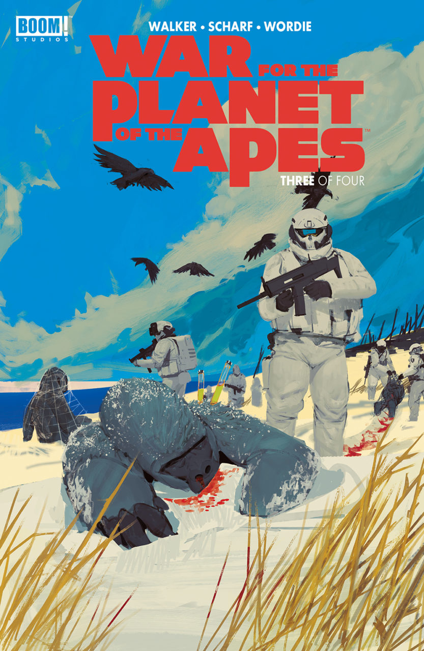
The licensed/creator-owned split is three to four this week. KaBOOM!’s six-issue crossover between Adventure Time and Regular Show hits issue two; War for the Planet of the Apes reaches issue three of four at BOOM! Studios. Power Rangers‘ issue (also at Studios) this week isn’t so much an issue at all as it is a poster book, which why it’s called The Mighty Morphin’ Power Rangers Poster Book.
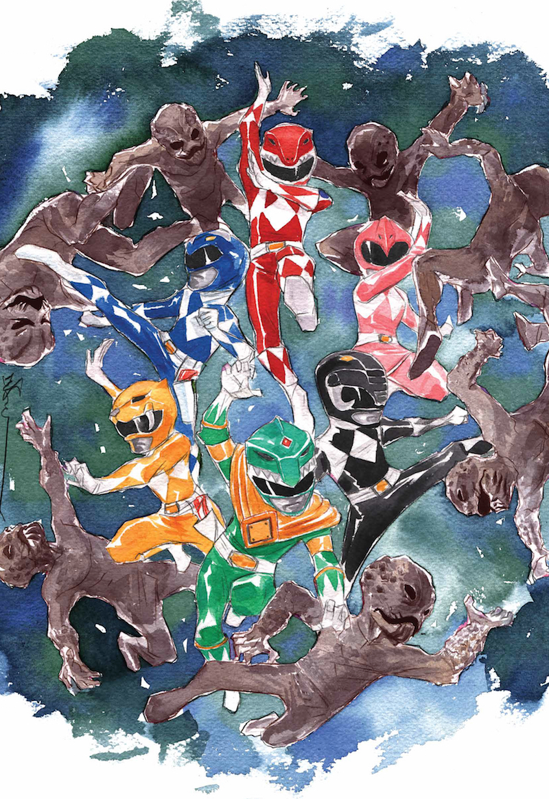
A poster book is a nice solution to the “but what will I do with all these variants” variant cover conundrum. No way near as expensive as prints, but something you can frame. There are some real smooth boys’ asses in this collection of images, a great (young) Jason David Frank likeness, and the printing of Dustin Nguyen’s poster (above) has taken real care to reproduce the texture of the paper he worked on. Care has likewise been taken to gather a collection of artistic attitudes: whether you like nostalgic character studies, action scenes, robotic layouts or design-centred style, you’ll be covered if you’re an MMPR fan. Billy, Zach and Jason aren’t served quite so well as Trini, Kimberly, or Tommy, but on the whole this is a very well-edited special edition. Good job, Dafna Pleban.
As if to make up for that slight, Billy and Zach’s actors will be at the BOOM! Studios NYCC booth (#1828) from October 5-8. Walter Jones and David Yost will be signing comics (and whatever else) “all weekend.” And for ComicsPRO’s Local Comic Shop Day, BOOM! are offering $99 blind boxes containing:
“[A] copy of the Mighty Morphin Power Rangers Year One: Deluxe hardcover; a limited-edition Mighty Morphin Power Rangers lithograph by Acme Archives featuring one of the Rangers, including rare Green and White Rangers; and two random, limited-edition variant covers from previous Mighty Morphin Power Rangers issues. In addition, 25 random blind boxes will contain copies of the hardcover signed by Saban Brands—Haim Saban (Creator of the Power Rangers franchise), Brian Casentini (Executive Producer, Power Rangers content), Melissa Flores (Director, Power RangersContent), and Judd “Chip” Lynn (Executive Producer, Power Rangers television series)—the company behind Power Rangers.”
I’m not really sure if the shop or the customer is supposed to buy these boxes. But as they’re confined to two hundred and fifty orders all told, if you’re after one or some of those things, talk to your local purveyor. Personally I kind of like the idea of having Haim Saban’s autograph [UPDATE DECEMBER 2017: haha ok strike that]. He co-wrote so many–some undetermined but definite number–great theme tunes!

Over in BOOM!Box creator-ownedsville, SLAM! The Next Jam begins with #1. I haven’t read SLAM! volume one, and frankly I found myself somewhat adrift. What did Knockout do? Why is everybody pissed? Why is CanCan so wishy-washy about it? I feel, as a reader, less like I am being prepared a sweet mystery to enjoy the solving of, and more like I just missed a whole volume. Pamela Ribon’s script is joined by the art of Marina Julia this time, though it’s behind a Veronica Fish cover (Fish having illustrated SLAM! whilst also servicing Riverdale and Nadia Pym). There’s a lot of colour and camaraderie, a budding mystery about why Teal Tank Top so badly wants a ride home, and plenty of aesthetic hooks to draw the curious reader in. But I really do recommend looking up the first collection… first.
 Though the opening of issue one makes the series hard to recommend, Grass Kings, at BOOM! proper, continues to prove Tyler Jenkins is possibly the best working crime cartoonist. Nobody is better at recreating for modern comics the feeling that cinematic noir gave us. Snow Blind with Ollie Masters proved that for me, but Grass Kings with Kindt is weeding out any contrarianism. In this issue, two apparently American guys with performatively Scottish names (Robert and Bruce) wander around asking people things that don’t get answered. It is casually, unobtrusively sinister.

BOOM! Box’s Lumberjanes #42 is the beginning of an arc about time bubbles. Thanks to mysterious voices and meddled-with devices, the camp is suddenly way up in the treetops! Which is lucky, because that means they can see… (spoiler~). Prior to the biggest events of the issue, though, the girls deal with ground-level weird phenomena such as the below. I’m not interested in this series on a personal level at all, but it doesn’t read too short, the pop culture references aren’t too annoying or too involved for a youth audience, and has plenty of characters for young readers to find their favourite in.

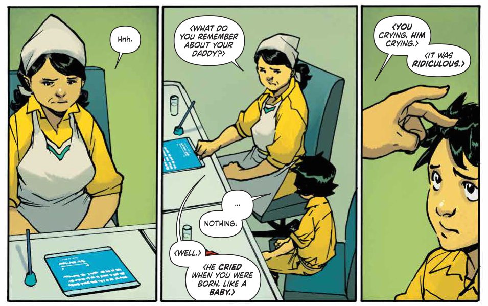
The second issue of smash-hit Pak/Miyazawa vehicle (haha, cos it’s about a mech!) Mech Cadet Yu is a feast for the eyes…and the heart. Trina Farrell has the candy-coated touch with Miyazawa’s lines that Christina Strain did on Runaways— he’s better than he was then, and Farrell keeps up.
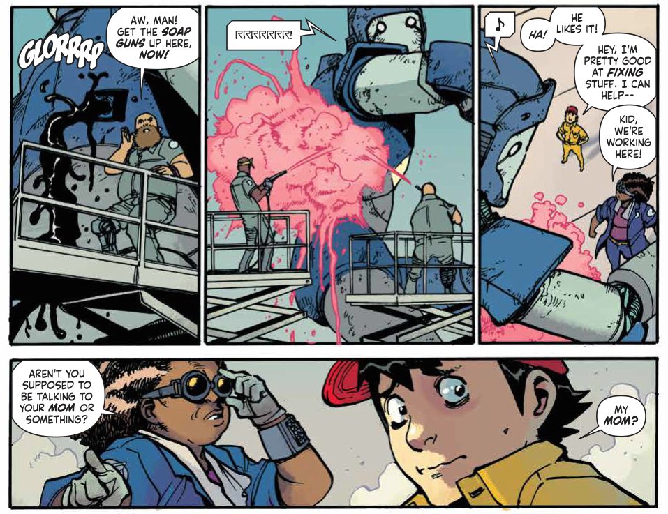
This is a great-feeling book: Stanford Yu is the cutest, his big blue robot is the cutest, his mother’s adult ambivalence to her son’s robo-dreams (“You know this is a military school. For war, Stanford.”) is the cutest, in a painful and pregnantly dramatic way. Yu joins his classmates (one Afro-Latina girl, one Asian girl, one fat white boy–no laurel resting here) and familiar genre dangers begin creeping in around the edges of the story. Edge of the seat, friends. Edge of the dang seat.
So we’re here! We made it to the end, and at the end there is a reward: Jane from Archaia. In hardcover.

Iiiiiiii love it. I love this story. I love the shape of this story. Which both is and isn’t something Brontë’s version owns. It’s archetypical.
(It occurred to me after I read this that Fifty Shades of Grey is just another Jane Eyre/Beauty and the Beast. Instead of a suffering wife or a suffering body he just has a sex dungeon and a pile of paperwork. It made me feel a lot fonder of the Fifty Shades fans, to tell the truth.)
Jane is shorter than it could be, which is always the trouble with a Jane Eyre adaptation. This straight visualisation of the novel has one hundred and forty four pages, which is fewer than half the number of pages the prose original demands. Bros and Perez’ version totals two hundred and seven, but it could have been more. Jane’s unhappy childhood is condensed (rather beautifully; it’s rendered in plain pencil lines instead of the inked and coloured pages that make up the bulk of the narrative) into eight pages (one for every year Eyre spent at Lowood?) right at the start. Inks and colours creep in as Jane reaches the city under her own steam, and begins to find a place, environmentally and socially, for herself there. Visually this book is a treat– Perez assisted Irma Kniivilla in the colouring of his lines, and the chalky bubblegum/autumn squash tones meet his combination of “studied” and “casual” very naturally. There’s a little of Georges Jeanty’s jaunty charm, but thicker, feltier lines break the speed of the thing if you see what I mean. If Jeanty and Aja had an artbaby. Maybe. Yeah? Anyway, it’s delicious. And his paneling is perfectly paced.
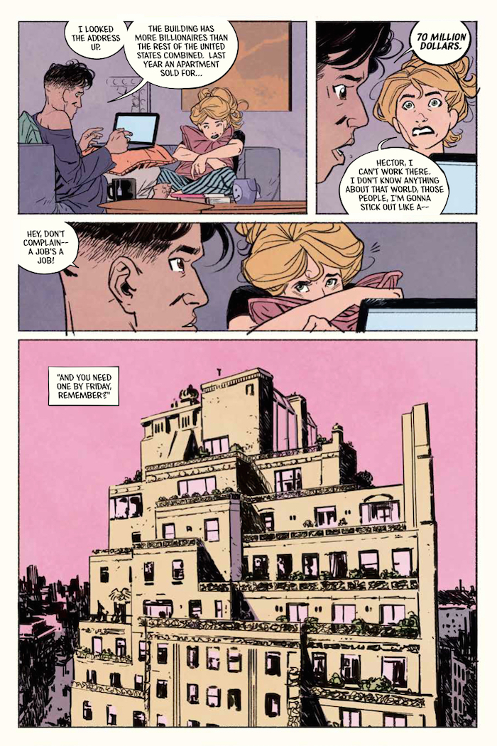
The problem with skimming over the events of Jane’s youth, boring though indeed they seem at the time when one reads the source novel, is that the reader does not get to know Jane in her formative environment. We do not see her inability to bend before other authorities before we see her refuse to bend before Rochester. This changes the dynamic of their romance; her strength is defined by him, instead of pre-prepared; he is a primary challenge instead of simply a new and concurrently desirable challenge. In Jane, Rochester’s enormous wealth is inherently sinister but, though she sleeps in a sublet closet, Jane’s poverty isn’t miserable. Hector, from whom she rents, is an excellent friend, and the money she receives from Rochester in her capacity as a nanny to his child gives her the social autonomy that Jane Eyre can only achieve by flight. And so the sinister nature of his wealth becomes something almost prehensile, sneaking around because it has nothing direct to push off from. This is a technical criticism, but it’s certainly more interesting than it is off-putting.
I don’t especially care for the long blonde Jane we get here. Her hair, I came to decide upon after long deliberation, just looks too expensively done. It’s so thick, it’s buoyant, it gently waves. It never looks dirty, unattractively mussed, or ill-cut. She’s supposed to be poor and desperate, right?
When Jane meets Adele is when I stopped caring about matters of canon. Adele is precious as she is precocious. And Pérez and Brosh McKenna can do simpatico! The warmth between the two is immediate and works very, very nicely as the anchoring emotional motivation once Jane and Rochester do start to collide wills.
This graphic novel sloughs off a lot of the prose novel’s eventfulness and defines a path to its own modern climax. “Mad Attic Wife” is exchanged for a secret less untenable in 2017. Bringing Jane Eyre to the modern day changes the story in some small but definitive ways: Brosh McKenna and Pérez have Rochester splash Jane with his car instead of falling from a horse in front of her, and Jane is pursuing a degree in Art instead of simply sketching as a hobby whilst pursuing an accidental career in childcare. Jane isn’t quite Jane Eyre, but it’s intense like Jane Eyre, and lustrous like Jane Eyre. Something to read over autumn hot chocolate? Nothing better, to my mind.
Oh, and Brosh McKenna wrote some of those movies you like, or something. I don’t know. We read comics in this house.
