

Who knew “gatekeeping” could mean tending to your recently awakened Kaiju of a gate? With brisk pacing and a clever implementation of character focus, Immortal X-Men is shaping up to be an all-timer.
Immortal X-Men #2
VC’s Clayton Cowles (Letterer), David Curiel (Color Artist), Kieron Gillen (Writer), Tom Muller (Design), Lucas Werneck (Artist)
Marvel Comics
May 18, 2022

There is an absurd idea occasionally floating about that reviews should be unbiased, but this is an impossible demand; they are subjective by nature. Bias is the point. My bias here is that I think Kieron Gillen writes damn good comics. While writing about the last issue, I waxed philosophically about Gillen’s previous time at the helm of an X-book, and his clever modernization of Mister Sinister. Something about that run that also deserves attention is that it’s tightly plotted, well-paced, and deeply satisfying to read, even now. I mention this because Gillen is a known quantity at this point, and there’s a reason his name being attached to a Krakoa-era book generated excitement. I’m pleased to state that two issues in he’s delivering on the promise of his name.
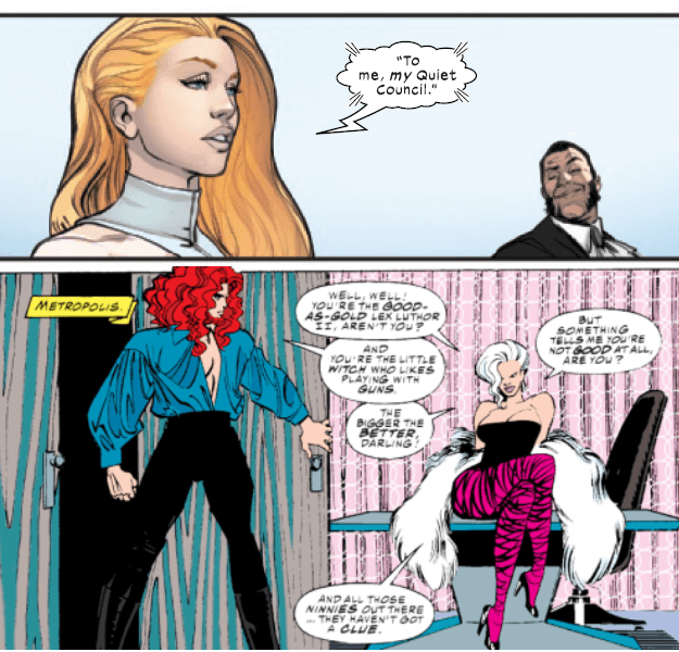
Immortal X-Men #1 balanced the standard demands of a first issue — a setting of scene and cast — against a once-more-updated character examination of Sinister. Issue #2 maintains that same formula; as the overall story focuses on Selene’s retribution over being denied a seat on the Quiet Council, we’re treated to another character portrait, this time of Hope Summers. I’ve never been a hater, as the parlance goes, but I confess that Hope has never been particularly interesting to me as a character. Something about her has always felt like an albatross around the neck. Someone had to be the first mutant birth after the Decimation, and writers from there would need to find a direction for that character, like it or not. It’s not that what was done with her isn’t good, it’s not that she isn’t good as a character, it’s just that her presence, for a long time, felt obligatory, inevitable even, and as a reader, I balk at that kind of approach to character introduction. It feels like being forced to eat a vegetable everyone knows you can’t stand at dinnertime.
All of this is to say that I’ve enjoyed the version of her that exists for Krakoa. She’s not had much time in the spotlight as a member of the Five, but she’s had a fair few guest appearances, and I enjoy how those have let her demonstrate her abilities as a leader in non-combat scenarios. Because of this, it might seem like returning her to a more direct combat role would be the wrong move in my eyes, but I find that Gillen’s portrait of her works fabulously. Hope rushes into the fray, shouting orders. But she’s entirely focused on saving lives first, and not just in a trigger-happy, “kill the bad thing, so it doesn’t hurt people” way, but in an actual focus on protection, on directing people to safety. Her personality here is assertive and confident, with more than a little edge to her temper, but it’s not as one-note and grating as it’s been in the past (see Rosenberg’s Uncanny X-Men run for comparison — or better yet, don’t). Similarly, her solution to the problem is uniquely “Hope Summers” in approach, and it’s satisfying as hell. There are no bad characters, just characters waiting for the right story.
What works for me here are in the visual styles presented by Lucas Werneck and David Curiel. As a sequential artist, Werneck is energetic without sacrificing detail. He depicts each character cleanly and distinctively — even without the telltale hallmarks of costume design, there’s no danger here of mistaking one character for another, no frustrating reuse of traced faces or stock poses. While certain panels did remind me of art I’d seen elsewhere, it was never in a referential way but one of mere coincidence.
I’ve been thinking some lately about modern trends in coloring comics, and Curiel’s work is a fine example of those trends done right. The panels above show a great example of that, too. His work is far more nuanced in color expression than older comics were even capable of, but he shows a level of restraint that too many color artists today fail at. Nothing is hyper-rendered, nothing is overwrought, but neither is he afraid of color: The shifts here are delightful!
Two issues in, Immortal X-Men is a flagship-style book that’s worthy of attention. If the plots in these first issues are a little overly internecine, it’s so that we have a chance to familiarize ourselves with the cast. I can’t wait to see where it goes from here.
