

Hello again friends! We’re here with another installment of Colorist on Color. This time we are joined by Tamra Bonvillain. She is a colorist living in the Southern US. Tamra has won multiple awards for coloring, from the Comicbook.com Golden Issue Awards in 2017 and 2018 to the Aurora award in 2017. She’s an accomplished graduate of the Kubert School. You can follow Tamra’s twitter at https://twitter.com/tbonvillain
This may be my new go to example to show how much color can add to a black and white page. pic.twitter.com/2BJNUvvPCa
— Tamra Bonvillain (@TBonvillain) June 26, 2017
You went to the Kubert School, so you have an extensive background in drawing. About how many hours of figure drawing did you do?
The Kubert School is a 3-year school, and you take 10 classes a week, split 2 a day, about 3 hours each. They teach figure drawing every year, so at least 3 hours a week was spent in the actual class. Every now and then, we might have done some extra figure drawing for the drawing class.
Do you have any particular body parts or objects you particularly love to draw?
I always really liked to draw faces over and over again in my sketchbook, playing with different features and proportions. I also love drawing weird, goopy body horror stuff. I’ve always liked those kinds of movies, too, so I just had an interest in it already, but something about drawing those shapes and forms is really fun, and you don’t have be as precious with things looking exactly correct.
I think one of the places your rendering style stands out is foreheads. How do you think about the planar changes to the skull?
I read so many drawing books and things that really focused on making those simplified forms of the head, like ones with the planes broken down. I dabbled a tiny bit in 3D modeling for games, when the models were still low poly, which are basically the same type of thing, and maybe locked that in my brain a bit more. I also usually try with lighting to pick a definitive, specific light source, and use those planes as a guide to where light would fall. Not that I think of it too literally at this point, but I think that’s still there in the back of my mind.
You mentioned in past interviews that Joe Madureira was an artist you took note of. What drew you to Joe Madureira’s work?
I started to get really into anime in the ’90s, that and just seeing video game art done by Japanese artists. I remember loving the game art for Street Fighter Alpha, and trying to copy that style in my own art. Joe Mad was the first person I saw trying to blend that style with American comics. I was mostly out of the phase of straight up copying other artists by the time I saw his work, but it felt legitimized to see a professional sharing those influences. I kept up a subscription to Uncanny X-Men while he was drawing it, and it was one of the only comics I got every issue month-to-month, so I would look at them over and over again.
You’ve developed a very unique way of using photoshop. Some of your technique comes from your time at Avalon. Can you tell us a little about what your job there was? How did this teach you to use Photoshop? How did you get the job at Avalon?
I did flatting for Avalon studios for years, starting in the early 2000s. I was on an art message board back then, and someone I knew had an in with Avalon, and got me in contact with someone to try out for the job. I had been using Photoshop since high school, so I had a baseline experience using it. The experience flatting mostly just got me more comfortable using Photoshop consistently, and more familiar with certain tools that were specific to flatting. I didn’t even know what flatting was or why it would be useful before having this job, that was huge on its own. What it did give me was a lot of professional comic art to practice coloring on.
I think the main epiphany came to me trying to color a picture of Spider-Man, and the way the different colors of his costume cut across his body in a way that made it very awkward to render if I was treating the red part separate from the blue part. It got me thinking of ways to be able to render situations like that as one continuous form. It was pretty crude at the time, but it got me thinking, and it’s changed and evolved a lot over the years. I also learned a lot doing photo retouching I did when I graduated from The Kubert School. It’s stuff that probably wouldn’t have occurred to me just doing comics, but it’s interesting how working on different problems can get your brain working differently and have some transferable skills.
Are there any colors you have trouble working with?
Any of the colors that get chewed up by the CMYK printing range can be challenging. Bright pinks, purples, greens, and blues are always difficult, and some printing profiles do weird things with red, where it doesn’t look as pure red. I just try my best to work color theory to my advantage. You can never get the intensity some of those colors can achieve on the screen, so you have to make the surrounding colors contrast them so much, they still feel as bright and vivid by comparison. Bright purples are the ones that I find the most tricky to stand out in that way.
What do you do when you get stuck?
I try not to dwell on that stuff too much. It definitely happens. Either I’m not sure what to do, or something just isn’t fully clicking for me sometimes. What I’ve found works best is to just move on if I’m not fully happy with a page. Maybe something will come to me by looking away from it, or working on the following pages. If I still don’t know what to do, I just turn it in. 1 or 2 things will happen: either they will be fine with what you did and you were overthinking, or they will have feedback on what to do better. Getting another perspective on it if it’s needed can be really valuable there, and doesn’t make me waste a bunch of times spinning my wheels.
How do you prefer to create mood when you are coloring?
I think I tend to focus more on the overall color palette versus dramatic lighting in terms of rendering and light sources. I will do both, but I think I’m more inclined that way. It’s a little hard to describe, because it’s so based on a gut feeling of how colors are affecting me and what seems right for a particular scene. Having clearly defined color by scene also helps differentiate scenes, locations, or even certain emotional beats that are being repeated. Something you’re not thinking about consciously, but if you open the page and you’re hit with this overall color palette before you start taking in the details, I think that helps both legibility and processing the mood.
Are there any lighting situations you dread?
Blue and red flashing police lights. It is one of the most obnoxious lighting problems to solve, in my opinion. And just generally, any kind of complex lighting set up with multiple lights that aren’t clearly defined, or like in a main light/rebound light kind of setup.
Do you do warm ups? If so what do you do?
What do you prefer to watch/listen to while you are working?
I mostly watch stuff, but it limits what I’m able to have on. Anything that is subtitled or too visually engaging is almost impossible to work with; I can barely get anything done. Finding a very long and easy to follow tv series is ideal, because I don’t have to keep looking over, but I also don’t have to keep stopping every now and then and decide on the next thing to put on. Every now and then I’ll put on some music, or I’ll catch up with podcasts or audio books. Those keep me the least distracted, but for some reason, tv shows/movies seem to work better for me. It’s weird, but they keep me juuuust distracted enough to stay focused on my work and not look for other distractions that would stop me from working entirely.
Who is your favored character to play in Overwatch? Why?
Pharah! You can fly and rockets explode, and you can get lucky and boop someone off a cliff sometimes. It’s beautiful.
What book you’ve colored are you most proud of?
It’s a really hard question! There’s a lot of projects I’ve been really happy with over the years. I guess, most currently, I’d have to say Once and Future. Kieron’s writing is great, I got to start working with Dan Mora, and I feel like we all click really well together. I tend to have a greater affinity for creator owned stuff, especially like in this case where I’m on from the start, because it’s like all us. We’ve all been there from the beginning, defining every moment, and it just feels like it’s all come together beautifully.

Wayward is incredibly involved with complex locations and magics, how do you keep all of this straight? Has your technique for magic changed now that you are working on Once and Future?
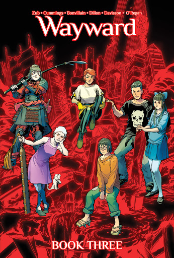
My technique has subtly evolved since working on Wayward, and I do some different things for Once and Future that are specific to that book, but I think I approach things basically the same as any other. I try to color in a way where all the steps are still present, and any one of them can be changed easily, without making me have to completely rerender anything. I color correct my flats to be local color, usually. So, a location that is in blue light or red light or natural light is always the same base color when I start, same with characters and anything else. I apply all the color effects after that stage. I will normally add an overall tinting effect to a whole scene, and then I create different rendering layers that lay over top of that. Any of these things can be changed later to change the color or value, and I can alter the base flats with the rendering still laid over top. That’s how I keep consistent locations and characters in any book. For Wayward, there were so many magic effects, I actually made a little cheat sheet where I saved all the effects in one place, so I didn’t have to constantly hunt down old files. I’ve also made little character sheets with all the colors for the different characters before, too, but usually only when a book has a lot of moving pieces. For most things, I just open up an old file that takes place in the same location or has the same characters on it, and copy the flats and rendering layers that I need, because those are all saved in layers. It makes everything easily repeatable.
Do you feel like you have developed specific looks for each book you work on? How do you develop this look?
I always try my best to adjust my coloring style to the art. Sometimes, I can approach different books roughly the same way, because they’re similar enough I think it still works. Then, I might get a book that pushes me outside of my comfort zone, and I have to develop some new way to work on their art. I don’t really think of this too consciously, I just kind of feel it out in the moment, but some of the things I base it on are things like, is this a cartoony style or more realistic? Is the linework really open, or very defined? Is it abstract or literal? That’s going to effect how I render. If it’s cartoony and clearly defined, then I’m probably going to go for more bright, poppy colors and tend towards a simpler, maybe even cel shaded rendering style. I’ve worked with artist Dani Strips before, and her stuff is very open and abstract, so I try to take a more textured, looser style.
How do you think about night scenes?
I think over time, I’ve stopped trying to be so literal with them. Does it always make sense that someone’s out in the middle of nowhere in the night without a clear light source, yet we can see them clearly? Nah, but I think clarity is more important than being literally correct. Sometimes you have a clear light source, and it makes it a lot easier, and I approach it much the same way as anything else. I do struggle with communicating it is dark without being too literal, and you are trying to be conscious of ink limits for printing as well. It forces me into maybe doing softer or duller colors, less contrast, and that’s something that is really outside my comfort zone.
Is there anything you are looking forward to doing with Wonder Woman?
Oh yeah! First of all, it’s great because I get to work with a bunch of people who I’ve worked with before and get along really well with. I’ve colored Travis a fair bit, and worked with Becky and Michael a few times now, same with the editors. I’ve also met Becky, Michael, and Travis in person, which is not always the case on books. It’s nice to feel connected to the team like that. Travis does some really cool character design work, and I think it meshes well with Becky and Michael’s sensibilities in the writing. Right now, the stories are very fantasy based, and that’s a nice break from straight up super hero stuff. I’m getting to do all sorts of crazy lighting and character work, which is right up my alley.
Thanks for joining us! As always if you have some colorists you’d like to see interviewed or topics covered, always feel free to hit me up!
