
It has been a great couple of years to be a tarot reader. The rise in popularity of self published decks has been amazing and some truly talented artists have undertaken the extraordinary task of illustrating all 78 cards. My latest tarot obsession is comic artist Isabella Rotman’s This Might Hurt Tarot Deck, a modernized deck in the Rider-Smith-Waite tradition. It had a wildly successful Kickstarter campaign earlier this year, funding in less than 9 hours, and is currently open for preorders leading up to its October 18th official release date.
One of the things about tarot is that realistically, it has a lot to do with how it makes you feel. And This Might Hurt felt great from the moment I took it out of the package and saw the deck for the first time. Before I even opened the box and saw the cards, it felt good to hold. The deck box was obviously designed with keen attention to detail—the gold leafing is both extremely beautiful and extremely high quality, and it makes a stunning first impression.

Quality is the first word that comes to mind when handling the actual cards as well. They just feel great to hold, which is an extremely important characteristic for a tarot deck to have—they’re thick enough to feel really substantial, but not so thick they’re unpleasant to shuffle. And the gilded edges of the cards, which are available in either gold or holographic black, are the cherry on top when it comes to quality. I got my deck in the holographic black and it has an incredible rainbow shine, like an oil slick. Honestly, I’ve never seen anything quite like it, even in a market where shiny gold or silver edges on cards has become relatively common.

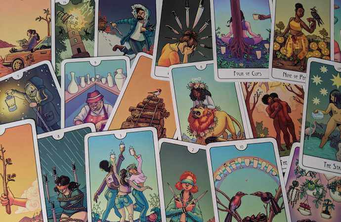
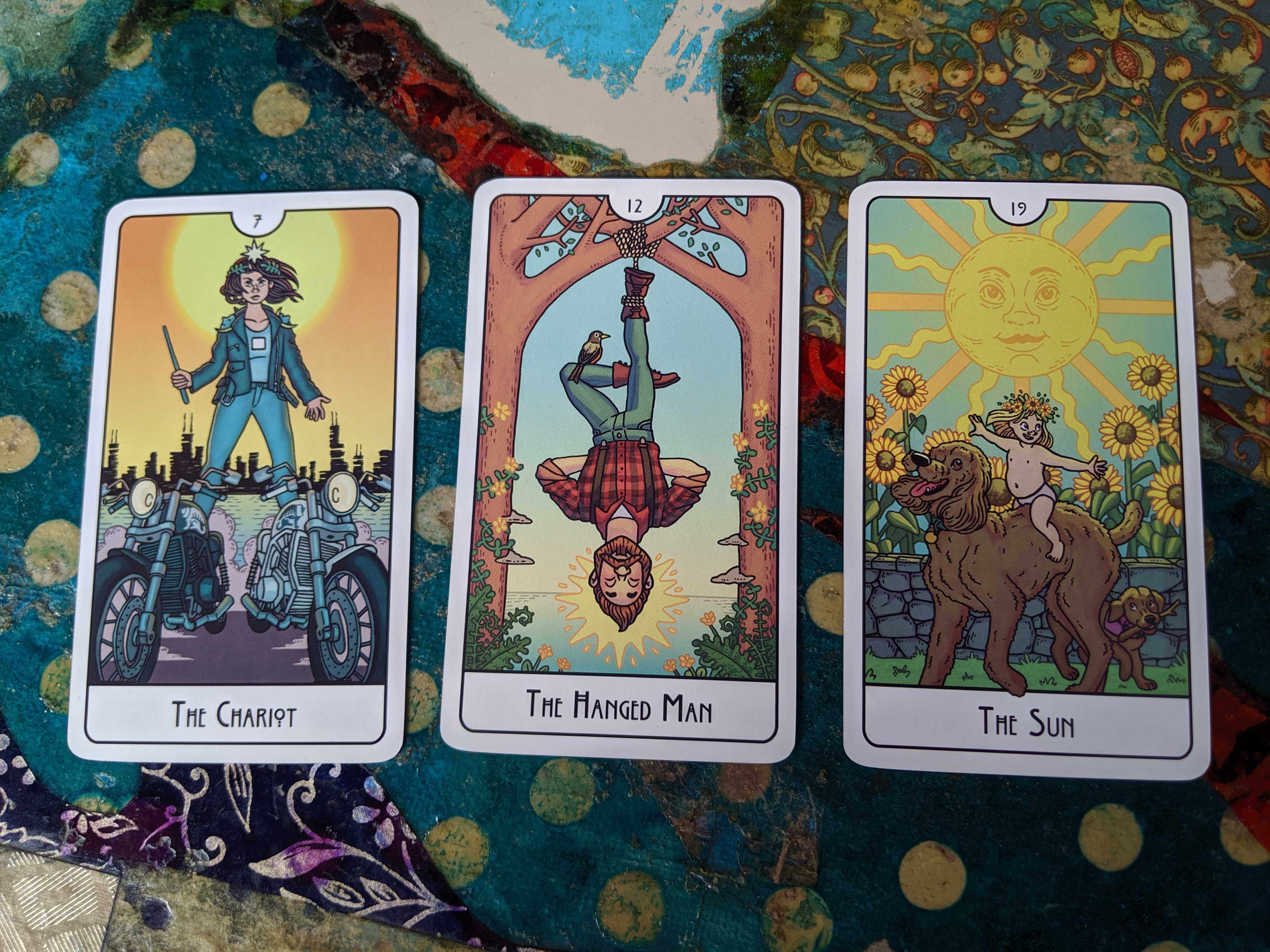
I was impressed even before I got to the content of the cards, but flipping through the deck for the first time was a delight. Addison Duke’s amazing coloring job stood out immediately, especially in the minor arcana. Each suit has a distinct color theme that ties all the cards together in a very organic way. And of course, it complements Rotman’s beautiful artwork, which feels modern—like the Chariot, depicted as a woman in a leather jacket, riding behind two motorcycles instead of sphinxes. The cards are fresh but still very detailed and full of magical symbolism. For instance, the Devil, depicted as a rather classical Baphomet figure, is presiding over a raucous gathering of partygoers who seem too preoccupied with their debauchery to notice the luminous chains that bind them.

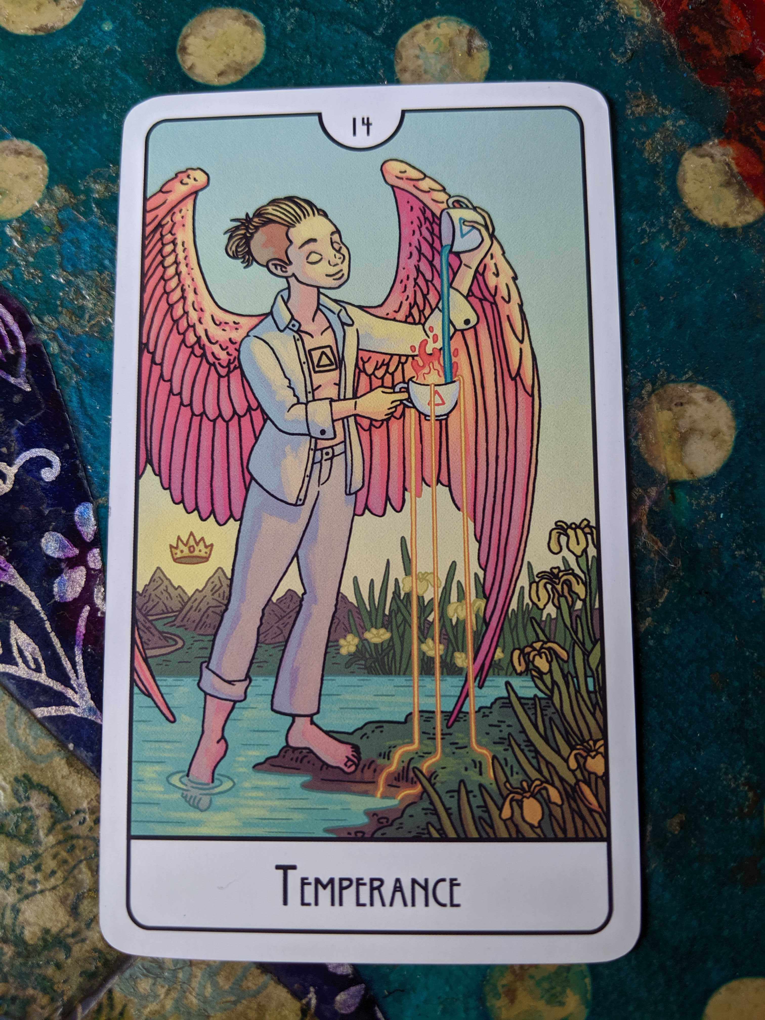
There was obviously care put into making the deck feel diverse and inclusive, and there are a wide range of skin colors, body types, genders, and relationships depicted in the art. One of the phrases Rotman used to describe her deck in the Kickstarter was “queerness is lovingly acknowledged” and it’s a lovely and accurate description of of the LGBTQ+ representation in the deck, which is particularly meaningful to me. The gay couple lovingly embracing on the Two of Cups, a card of fulfilling partnerships, definitely stands out, but my favorite card in the whole deck is Temperance. Never have I looked at a tarot card and felt so much like I was seeing myself, a blonde-mohawk-having non-binary person. It’s hard to tell but it even looks to me like they have top surgery scars similar to my own. The description in the book confirmed my feelings—“the merging of fire and water, multiple genders, and of water and land all represent the combination of opposites.” It’s seriously a rush feeling legitimately represented in a deck for the first time.

The art and symbolism is based on that of the traditional Rider-Smith-Waite deck and its iconic art by Pamela Coleman Smith—and it draws inspiration from it heavily enough for it to feel inherently familiar to me as a veteran tarot reader. But it’s certainly not just a redraw of a classic deck. Many of Rotman’s cards bring their own spin or fresh angle on the classic interpretations. Consider the six of swords. The classic card depicts a gondolier guiding a woman and child across a body of water and the swords surround them in the boat, protecting them from the outside world. Rotman’s six of swords shows a lone figure piloting their own small motorboat through choppy water towards calmer seas, with a water snake following behind. The overall meaning is similar—a transition where something difficult is left behind—but the different nuances in the imagery gives the card a different feel.

But don’t worry, you don’t have to figure out all the nuance yourself! The deck comes with a book that includes a thoughtful description and interpretation of each card. I often feel like I don’t need the corresponding guidebook for new decks because I’m already familiar with the cards and their meanings, but I love this book. It’s extremely accessible and its thoughtful insights are simple enough to understand for beginners while still providing something substantial for veteran readers to chew on. Each of the cards in the minor arcana also has a pithy tagline to sum it up, which is a great addition. The minor arcana can tend to blur together for inexperienced readers and these slogans make the meanings more accessible and easier to remember. Some are also funny—my favorite is the five of swords: “you won but you were a jerk about it.”
All in all, this deck strikes a great compromise: it’s familiar enough that I can pick it up and read from it immediately, but also original enough that it brings something new to the table, that makes me want to reach for it over other decks.
So pick up and read from it immediately, I did. My readings with the deck have felt … pretty honest. I’m often drawn to decks with imagery that feels gentler than the traditional art, and This Might Hurt isn’t really like that—it’s certainly not overly harsh, but it doesn’t sugar coat things, and the readings I’ve done have reflected that. It tells it like it is, not in a cruel way, but like a friend who’s leveling with you because you deserve the truth.
Between the approachable explanations and the lovingly inclusive art, I predict This Might Hurt Tarot Deck is going to be a crowdpleaser for new and old tarot readers alike. (No, the cards didn’t predict that one for me, I did it on my own.) Check out the website if you’d like to see more of the card art and descriptions, or preorder on Backerkit if you can’t wait to get your hands on the deck!
