
Encountering tables or shelves full of manga can be overwhelming, and you’re not always ready to do a month’s worth of research before you feel like buying a book. So how do you pick from the mess? You judge it by its cover.
I do, anyway. Last time I judged Durara!, These are my thoughts on Fairy Tail.
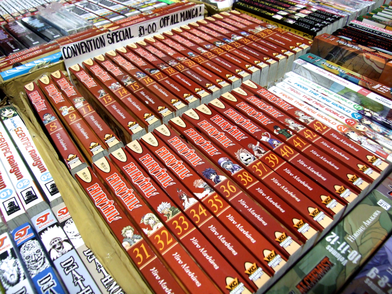
These stand out unavoidably. Thirty-four tankobon in varying shades of dried blood. They’re a clot:
 The spine
These look terrible, they are terrible. Generic brush-style text on the author name, volumes labelled with house number-style typography, character busts in colours far paler than the rather glum red that dominates. The yellow that tops and bottoms these spines is too pale to relate well to the pumpkin orange of the numbering, and it’s extra-confused by the clear red of the title. Not all of the volumes have matching printing, and volume thirty-five even seems to have been incorrectly set–note how it doesn’t line up with the volumes on either side. Worst of all, this series is huge. Every quibble is there again and again, and again. It’s a bludgeoning visual.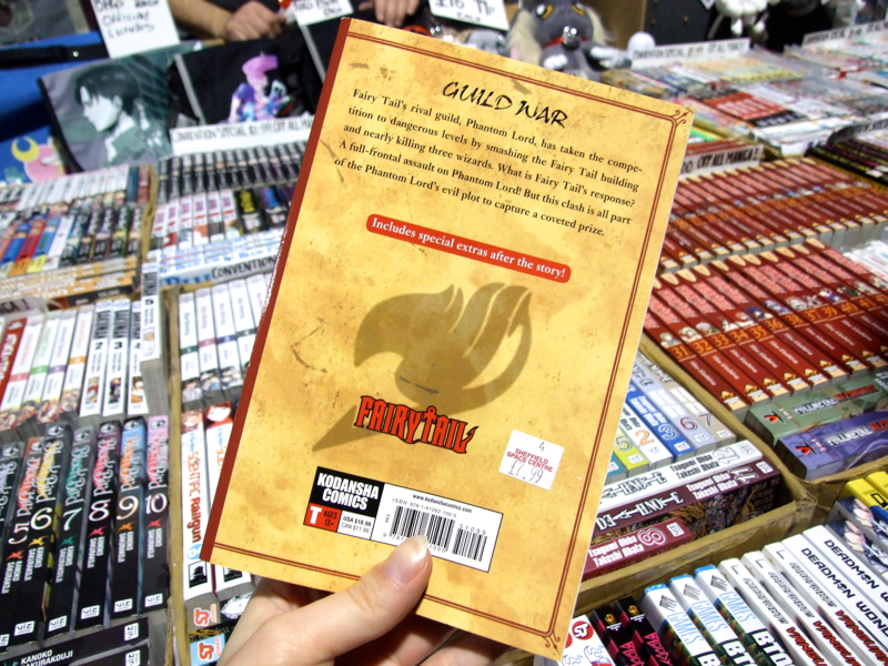
The back cover
Tragically generic! “Old parchment” background texture, slightly too intensely coloured to convince. An outdated font for the inside of a novel on the outside of a collected comic. A big “shadow” motif, which is so much larger than and so oddly aligned with the title logo that the whole looks unfinished . I’m pretty sure I’ve seen that red special extras bar on Scholastic books. It’s so basic (blurb too: guilds? Phantom Lord? Wizards?) I made a note to check if this is a parody title. I don’t think it is — the intention, I believe, is to evoke ye olde familiarity. And, OK, it does. But it’s familiarly RUBBISH.
It seems that the original Japanese releases had essentially the same design; maybe it works better in a different cultural context.
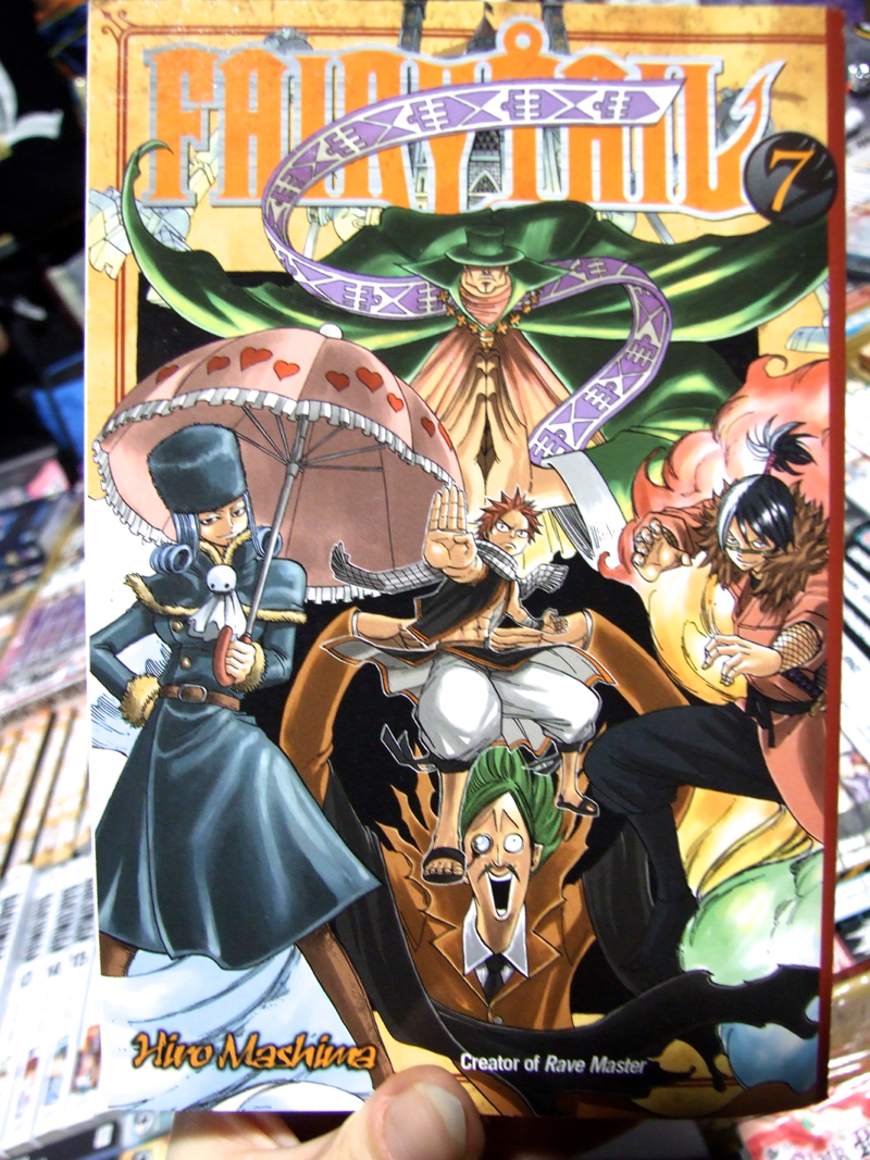
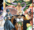
The front cover
This art is so much more competent than the design it’s surrounded by–anatomy’s regular, foreshortening’s all there, clothing creases convincingly and everybody has their own expression and internally coherent outfit–that I almost want to buy the book in sympathy.
But not quite.

