

Vampirella is being rebooted and recostumed again! Dynamite has announced that they will be rebooting the comic for the second time in recent years, with a new creative team and another new direction. Paul Cornell and Jimmy Broxton (Knight and Squire, Saucer County) will be taking over the book and delivering a Vampirella for a new generation–or something.
Late last year, Kate Leth and Nicola Scott took over the book from novelist Nancy Collins and a rotating team of artists who’d helmed the book for several years and throughout Gail Simone’s “Swords of Sorrow crossover” event (which we covered extensively here on WWAC.) Leth and Scott’s interpretation was a much-hailed new take on the character, but it didn’t seem to connect with readers and will soon come to an end. Similarly, Collins’ arrival on the book was covered wide and far–a vampire novelist on a vampire comic! How perfect, but her tenure has been much less so. Vampirella struggled to find press and connect with readers.
The thing is, the comics just haven’t been all that good. Before Leth and Scott and before Collins, Vampirella bounced around from creator to creator, backstory to backstory. Neither the character nor the comic has had a truly definitive run since the old Vampirella Magazine folded. I think many longtime comic readers would be hard pressed to explain her backstory or powers or could recognize her out of the red, collared bathing suit that is, well, a certain kind of iconic. (Who hasn’t winced at a prominently displayed Vampirella statue in the window of some sweaty local comic store?)
Costume is important to all characters, but at this point, it’s almost everything that Vampirella has; the costume has more than overshadowed the character. Any successful reboot will have to lead with a solid take on the character’s clothing. So does the Broxton design work? To answer that question, we decided to look back at Vampi’s costume through the years.
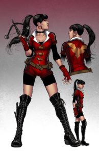
Jimmy Broxton (2016)
This is the latest redesign, for the new series Paul Cornell and Jimmy Broxton. Cornell described the art as Modesty Blaise-esque. Some WWACers confused the design with Dark Phoenix and Wonder Woman’s costumes. Cornell describes the series as “where gothic meets science fiction.”
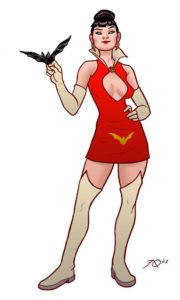
Nicola Scott (2015)
This recent redesign was hyped for getting Vampirella out of the bathing suit, but it put her in awkward bike shorts. The series, by Kate Leth and Nicola Scott for Dynamite, didn’t last very long and is already being rebooted. Their Vampirella was a motorcycle-riding hunter.

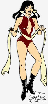
Trina Robbins/Frank Frazetta (1969)
Vampirella’s original costume, most famously drawn by Frank Frazetta, was actually designed by Trina Robbins. The costume and character were modeled after then contemporary horror hosts. She was an alien space vampire turned Earth adventurer.

Consistent elements of most Vampirella costumes include black boots, high white collar, a gold bat motif, and lots of red. Included above are the two most recent redesigns and her classic costume design. How effectively do these costumes do the important work of designing the character? That is, do they tell us about who the character is, what they do, and where they are from?
Kayleigh Hearn: The original costume as drawn by Robbins and Frazetta (and not the later artists who turned it into three pieces of red duct tape attached to a white collar) is perfect for a an alien space vampire character. Her big collar and curtain of jet black hair suggest her vampiric nature without cliches, like big, batlike capes. Vampirella looks like she just stepped out of the cover of a lurid 1960s paperback (“Beware the Beauty from Beyond … KISS THE SPACE VAMPIRE”), and she reminds me of that other sexy, spacefaring Sixties “Ella,” Barbarella. For a long-delayed update to the character, Nicola Scott’s redesign is very dated, like a generic RPG vampire hunter, or the star of a syndicated action show that followed Xena in 1998 and lasted one season. Like many modern Wonder Woman redesigns, it’s so consumed with checking off, “Is this a progressive female character costume?” boxes (“Does she have pants? Is she wearing practical boots without heels?”) that it forgets to be aesthetically appealing or really tailored to the character.
Al Rosenberg: I wanted to like the new Broxton design, but it looks like something my friends would wear to the club. It’s too simple, it doesn’t tell me anything about the character at all. (Although I am a big fan of the blood dripping onto the cat.) Vampirella is definitely one of those characters I’ve tried to get into over the years, but have always fallen short of actually investing in. A lot could be done with her character, particularly with regard to costuming, yet I regularly feel disappointed. I agree with Kayleigh about the first outfit.
Doris V. Sutherland: I like Vampirella best when she’s camp. Everything from her name to the “Planet Drakulon” backstory are all so gleefully ludicrous that I do not quite understand why some incarnations of the comic try to play her straight. With that in mind, I think that the original white-collared microkini is just perfect for camp versions of the character, but looks wildly out of place when she’s meant to be taken seriously. Both the Nicola Scott and Jimmy Broxton costumes look fine to me, but I don’t think they capture the silly appeal of the character.
Ginnis Tonik: I love the Jimmy Broxton redesign, but not for Vampi. She is an absurd character, and the original Robbins costume is perfect for that. I think in redesigning the three Dynamite lady big-wigs, Red Sonja, Vampi, and Dejah Thoris, there was like Kayleigh said more of this let’s hit the points on the strong female character redesign. There still seems to be a lot of difficulty with redefining, redrawing, and redressing these characters for a female audience that ignores context. For example, Vampi is a space vampire–that just begs for the ridiculous, the absurd, the camp! Red Sonja is a warrior barbarian–still sensationalized–but in comparison to Vampi, more somber. For me, the main problem with ignoring this context is that it ignores that women have been an avid comic audience for decades, despite the popular representation of comics as men’s reading material of choice. We already liked a lot of elements about these characters, but there’s also a lot of stuff that is wrong because patriarchy. It’s a hard line to walk, well to even draw (see what I did there!), and I appreciate Dynamite experimenting with this without falling back, mostly, to omg-put-them-all-back-in-duct-tape-bikinis!
Just in terms of aesthetics, which designs are the most appealing? What elements do you like or dislike?
Kayleigh: Fictional vampires are very monochromatic, from Dracula’s typical dark suit and cape to Blade’s black leather trench coats. So I love that Vampirella’s main color is a bold, “corn syrup blood from a classic Dario Argento movie” red. I love a good knee-high black boot–I have four pairs at home myself. Jimmy Broxton’s design looks like a Her Universe Dark Phoenix dress–not necessarily a bad thing, since a lot of women would totally wear it, but it’s a big branding problem if we look at Vampirella and think of a different character.
Al: The large logo is a thing I despise. How corporate, how outdated. Why do superheroes in general need a giant label to distinguish them from others? How many men in black capes are responding to the bat signal? How many red, white, and blue, corn-fed flying men are there that we need a giant “S?” Particularly for a character like Vampirella, who is on the outskirts of this super culture, the large logo is unnecessary, and tacky.
Doris: I think that the Nicola Scott costume is nice enough for a less camp urban fantasy title, but there’s so little left of the classic Vampi that she looks like a different character altogether. The Jimmy Broxton costume is more interesting. She looks like she’s hosting a party, which would fit with her original role as a horror hostess who introduced various self-contained stories. Out of the two rebooted outfits, Broxton’s take grabs me the most: the Scott design suggests fairly typical vampire-hunting, but the Broxton outfit makes me intrigued as to exactly what she’s going to get up to.
Ginnis: Like I said earlier, I love the Broxton costume just because it’s current and stylish, though I don’t see why the emblem has to be more phoenix than bat. But, it’s not for Vampi. Despite my adulation for Scott and Leth, I think their design is too dull for Vampi–she’s not Buffy, and as a lover at the altar of Cassandra Peterson, that is Elvira, I hate the absence in her costuming of her horror hostess origins. And I just cannot get behind shorts under shorts. Say it aloud. Finally, like Kayleigh said in the beginning, I like the original Robbins costume, but not when some artists render it to mostly underboob and mons pubis.
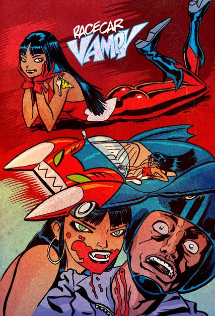
Back in 2008, Project Reboot held a contest to redesign Vampirella’s costume. There were lots of great submissions, including pieces by Jemma Salume and Ming Doyle. What do you think of their approach to redesigning and reinterpreting the character? (Also, note the similarities between this Joe Quinnones design and Jimmy Broxton’s!)
Kayleigh: Of the Project Rooftop designs, Ralph Niese’s jumpsuit Vampirella really jumps out at me. It’s cute, but also has that lurid, retro pulp feel I like in a Vampirella design. Very Deathrace 2000. Ming Doyle seems to be going for something in the same vein. (The jugular vein, that is. Oooh!) Joe Quinnones’s design works for me except for the placement of the gold bat right above the crotch. Maybe the gold bat has to go completely.
Al: I love the scope of these interpretations! I’m always going to be excited about the dominatrix spins on her character, because space vampire screams sexy-fear to me. Though I do not think this outfit is really for Vampirella, my favorite piece of art is by Gilles Vranckx. It seems almost gore-y. I love it.

Doris: I’m very taken with Ralph Niese’s black bat Vampi, who resembles a long-forgotten Golden Age superheroine: she’s still camp, but she’s a different flavour of camp, which I suppose is what I’d prefer from an out-and-out redesign.
Ginnis: Oh my gosh, I had not seen all of these before, but Ralph Niese’s race car Vampi is perfection to me. It has the space-vampire feel with the red jumpsuit, the neckline and gloves, and hair, remind me of the horror hostess, and there’s an overall 1960s feel that has a great Barbarella, space babe feel to it. I love it. The Carly Monardo one appeals to me for similar reasons–it has an updated space babe feel that is certainly sexy, but less potentially objectifying. But I miss the more traditional identifiers of Vampi, the more traditional collar, the lack of white, the bat emblems; it’s a little too streamlined–definitely more ass-kicking space vampire, but less space-vampire from Planet Drakulon. I am surprised by how much I like Edward Chow’s design though, considering it has more of that urban vampire hunter feel to it. I don’t know if I like it for Vampi, but there’s something there that intrigues me.

Vampirella was originally an alien space vampire who took to adventuring on Earth. Later retcons made her the daughter of Lilith, an ordinary Earth vampire with a few extra talents. Her stories usually involve sci-fi, horror, silliness, and sex. With that in mind, what do you want from a Vampirella costume? Do you think any of these costumes get it right?
Kayleigh: I love the idea of Vampirella modeled on horror movie hosts, but I don’t think any of her designs have captured the right mix of campy, spooky sensuality. Her original costume is a relic; we don’t need any more costumes so intimately cut as to reveal whether or not Vampirella waxes. Her latest design is modern and fashionable, but lacks distinct branding. The right elements are there–a deep red color scheme, black boots, a stylish haircut–but I think the perfect Vampirella costume has yet to be designed.
Al: I either want otherworldly, not-of-this-fashion-planet Vampirella, which Jemma Salume might come close to in her impish jumpsuit, although it’s still too “uniform-y” for me. Ming Doyle’s cut-out jumpsuit might work for that too. Something that says, “I have no idea what you earthlings are putting on your body, I just need something practical and sleek for my spooky doings.” If we’re going Daughter of Lilith route, than I really want to see more Gothic inspiration. Where’s the draping? Where are the seductive folds of cloth, the layering of sensual fabrics, the suggestive use of trimmings? And if it’s Lilith’s daughter in the space age, then I am a fan of Carly Monardo’s interpretation with the focus on latex.


Doris: Vampi was a product of her era. She was created in 1969, when the old-fashioned Bela Lugosi style of vampire was on its last legs and the genre was looking for new interpretations, resulting in her weird combination of white dress collar and red sling bikini. Since then, she’s been caught between camp sci-fi and conventional Gothic horror. Out of the contest outfits, I think Carly Monardo’s take captures the former quality, while that wince-inducing, borderline guro costume by Gilles Vranckx would fit a more horrific take on the title.
Ginnis: If the Carly Monardo design had a few holdovers from the traditional icons of Vampi then I would be all for this redesign. It actually takes the context of the Vampi redesign to know for sure this is Vampi for me–without that, it would take me a moment. She just needs a bat emblem, or a white collar, something.
