Sarah Horrocks talks comics with high standards, entry level requirements, and no quarter given. Reviewing her work feels like an exam. I’m raising my hand in McGonagall’s class.
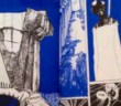
Bruise, her 2014 risograph from Sacred Prism, is the first time I’ve read Horrocks’ comic output. I’ve looked at her art before, I’ve read her crit, and her interviews. These things aren’t separate. She makes that point succinctly on her own WordPress blog. But they’re different.
First of all, do you know what a risograph is? I learnt this recently and my understanding is patchy, but a risograph machine is basically a magical photocopier. “Risograph” tends to mean a comic or zine that features linework, texture, and colour blocks printed in a low number of wild colours: a photocopier that copies in hot pink, or chartreuse, instead of black. Bruise‘s printing is black and blue, on white paper. Hey, look, that’s a joke. And that’s a clue to the sort of creator Horrocks is, the way she thinks about “comics.” It’s not just panel-panel-panel, window-window-window, peep-peep-peep. The product is the comic. The action, the ambient narrative, the creative urge, shows in the entire product. Art comics.
Google image search result for “risograph”, to give you the gist
Bruise is a little book. A5 (210 x 148 mm or 8.27 x 5.83 inches). This strikes me as starting with her hands tied — Horrocks is great at colour, which is limited, and great at space-filling, and limb extension, which is limited. She’s butting against boundaries. Another reason to call it “bruise?”
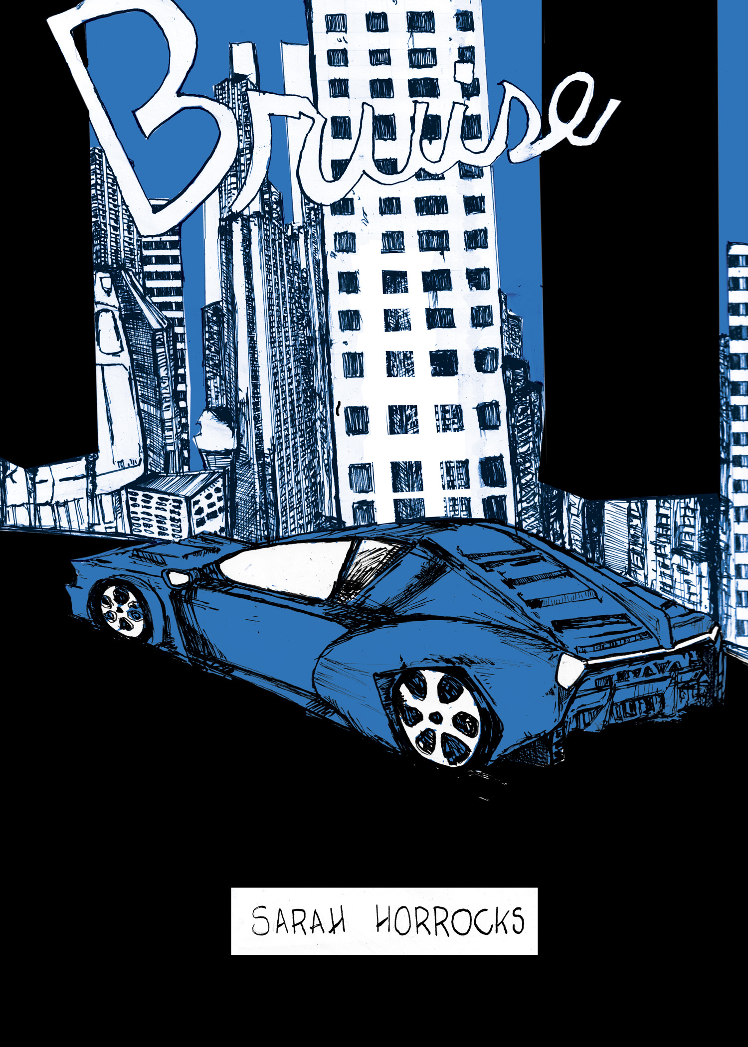
Page from HECATE SNAKE DIARIES Vol 2, Sarah Horrocks, 2013
“Bruise is like what you get if Speed and Ghost in the Shell had a very gay Fassbinder [note: not Fassbender] baby”, Sarah says on her WordPress, “It is the only comic you’ll read this year that has cum-activated nano-spiders.” That’s a claim I’m surprised Marvel hasn’t tackled but unlike Sarah, Marvel probably isn’t ready to start a comic with on-page fellatio. The penis is covered, technically, but if you’re trying to read this on a train, like I was, don’t. Anyway, notice that all three of the artist’s references are cinematic. It’s easy to mistake “cinematic comics” for a phrase meaning “a full set of storyboards in these regularly sized panels, six per page,” but Horrocks puts the lie to that. Her leaning on these references seems to me to be an oblique critique of the comic book establishment — “I can’t find anything meaningful to compare my work to, that a general comics audience would recognise.” It sounds aggressive and arrogant lain out that way but I think it’s more elaborately mischievous. You can switch off, or you can choose to give her some credit. Horrocks is a comics person, an arthouse viewer; she can talk about whatever dead underground European genius cartoonist, she could give you unrecognisable, artistic comparisons. Becoming a film is a trophy for comics right now. I like how Horrocks doesn’t care about looking modest, and goes straight for the jugular with “look how it’s already these films you know and love! But it’s a comic, which is better!”
Ghost in the Shell was a comic before it was a film, yeah. It’s recognised as a film far, far more widely than it’s known (or enjoyed) as a comic. I’m taking that as part of the joke.
Repetition of the same character model within one broadly-defined “panel” tells you about the motion happening within this reality we’re peeping. It trusts you, or requires you, to keep up. Sometimes I don’t. Sometimes I have to give up the idea of comprehending “what happened” for dead. Attend the wake: concentrate on the visible consequences of whatever happened. Conventional wisdom says that if you can’t follow the sequence of events through the panels with ease, the cartooning’s failed. I’ve already been considering how much that’s actually true; Roman Muradov’s Picnic Ruined starts in the middle of things, explains nothing, and uses visual metaphor in a stream of consciousness. It’s not comprehensible, but it allows the artist to stir our empathy. Not as sentimental as that sounds. It makes you half-forget your response to the comic, in favour of aiming to clone the experience the protagonist is having. You’re possessed by their perspective, allowed a glimpse into somebody else’s receptive feed. Not “you, looking at them looking” but “them looking” — remember on Roswell High how alien shenanigans led to Liz seeing herself through Max’s eyes? That wasn’t Liz thinking Max thought Liz was beautiful. It was Liz living Max thinking Liza was beautiful.
Remember?
I could feel everything he was feeling. I could feel his loneliness. For the first time I was really seeing Max Evans. I saw me as he saw me, and the amazing thing was, in his eyes I was beautiful.
That wasn’t Liz thinking Max thought Liz was beautiful. It was Liz living Max thinking Liz was beautiful. Bruise offers a similar experience, minus the teen alien romanticism.
Bruise is hard to follow; I won’t step around it. It needs a slow read, more of a “looking at” than what you’d generally call “reading.” There’s no hand-holding, dialogue, or visuals; the first speech bubble says “Remember Raster, for Yuri to avoid assimilation by the net global construct…” What? I mean I can deal with memetic cyberpunk, but it’s not a hand-holding welcome, is it? We don’t know where we are. We don’t know where the characters are all spread out, one sucking the other’s dick. A perfunctory establishing skyline is top right of a double page spread, either appearing twice or showing two different parts of a city, looking more like a bored kid’s homework graph than any place relatable. Eventually you can sort it out to “in a car, on a highway, one of those future highways that I guess America already has, where you can see tiny skyscrapers hanging elevated, miles off.” It’s not so hard that it’s impossible — a leisurely read rewards you with a shot of otherlife. Whoever these people are, their lives are chaotic enough that chaos seems mundane, like doing the same thing you do every night is mundane. Not “bad” or “uninteresting.” Like Kel said: Aww, here goes.
Critic, ex-Editor in Chief at WWAC, independent comics editor; the rock that drops on your head. Find me at clairenapierclairenapier@gmail.com and give me lots of money

 Sarah Horrocks talks comics with high standards, entry level requirements, and no quarter given. Reviewing her work feels like an exam. I’m raising my hand in McGonagall’s class.


 Bruise is hard to follow; I won’t step around it. It needs a slow read, more of a “looking at” than what you’d generally call “reading.” There’s no hand-holding, dialogue, or visuals; the first speech bubble says “Remember Raster, for Yuri to avoid assimilation by the net global construct…” What? I mean I can deal with memetic cyberpunk, but it’s not a hand-holding welcome, is it? We don’t know where we are. We don’t know where the characters are all spread out, one sucking the other’s dick. A perfunctory establishing skyline is top right of a double page spread, either appearing twice or showing two different parts of a city, looking more like a bored kid’s homework graph than any place relatable. Eventually you can sort it out to “in a car, on a highway, one of those future highways that I guess America already has, where you can see tiny skyscrapers hanging elevated, miles off.” It’s not so hard that it’s impossible — a leisurely read rewards you with a shot of otherlife. Whoever these people are, their lives are chaotic enough that chaos seems mundane, like doing the same thing you do every night is mundane. Not “bad” or “uninteresting.” Like Kel said: Aww, here goes.
