
A few Christmases ago my mom got me a couple comic books she’d found in a bargain bin. Her thought was: “These are beyond mortal comprehension…better give them to Zoe.” I sat there with two issues of Gold Key’s Brothers of the Spear in my hands and thought, gosh, mom, I don’t know where to start.

There’s a lot that’s wild, stupid, and wonderful about Brothers of the Spear, but the first thing I noticed when I flipped it open was, why are all these black people thoroughly and intensely green? Next to these extremely normal looking white people? Are they Skrulls or something?
I’ve tried to answer that question in practical terms here. What I’ve been so far unable to do is explain my own reaction to the ashiness of it all. The long and short of it is that the bad coloring was an unfortunate quirk of the printing process adopted by the vast majority of the pre-1990s comics industry, and of the paper stock they chose. It wasn’t an unavoidable situation by any means—Jackie Ormes comics, for example, were successfully incorporating multiple shades of brown skin on newsprint way back in the 1950s. But in superhero comics, technology and market forces conspired to produce this twenty-year long Problem that just…eventually went away without so much as an, “oops, our bad!”

I know that this is a collectors’ debate: contemporary reproduced versions of older comics are recolored using contemporary materials and technology, so they look perfectly fine. But it’s a bummer to think about how bad the first black superheroes looked in their early appearances, how even the basic infrastructures of the industry were stacked against them before the story, art, and reader reception even entered into it. And, as book historian Jonathan Olson has pointed out in a conference presentation he graciously shared with me, comics scholarship has become reliant on reproductions. In many cases attentiveness to the original published format can enrich our understanding of the text as a whole. Many of the earliest black superheroes would have looked quite strange in their original appearances due to problems with printing. Any reading of Luke Cage, for example, would benefit from an understanding that his invulnerable skin was often significantly marred by printing error.
Shirley Cards: Chemical “Normal”
Photographers have been talking about the material barriers to black representation for years. Photographer Syreeta McFadden wrote about the instability of her own skin when she processed it through film: “In some pictures, I am a mud brown. In others, I’m blue black. Some of these pictures were taken within moments of each other.” On film, the problem was partly chemical. McFadden describes the use of Shirley cards, photos of women whose white skin was used as a measure for the proper balance of chemicals in a film emulsion.
Brown skin did not exactly benefit from this treatment. Black photographers have always found their own workarounds; there has also been some belated technical improvement over the years, but it has been at times insultingly secondary to other “advancements”: according to Lorna Roth, a scholar who has dedicated herself to the study of racial bias in visual technologies (including the Color Balance Project), Kodak worked on improving its range of brown tones only as a result of pressure from chocolate and furniture companies.
Photo technology, in some way, attempts to represent the real world. The apparatus of the camera interacts with light to capture an impression of an existing object similar to the one our eyes would produce. Photography’s failures in the representation of dark skin lie in “calibration,” in the disjuncture between the human eye and the technological eye as it’s been informed by and calibrated to whiteness. Bradford Young, the cinematographer on films like Selma and Arrival describes the “bias built into the negative.” Comics aren’t meant to be indexical representations of real black bodies, in that way. It’s not a failure of the technological “eye” in the same sense. It’s a failure, rather, in the ink—in reproduction on a massive scale.
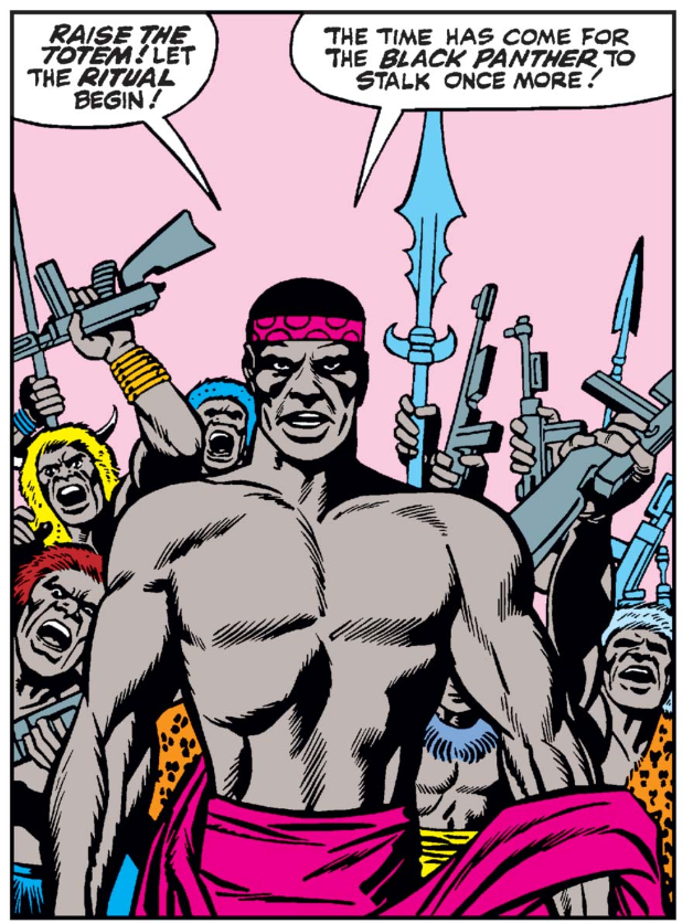
Before we get started with Luke Cage: Hero for Hire, I’ll make a quick note on method: I’m not going to talk about the content of these comics at all. I’ve picked up these copies here and there over a year or so and have selected them to look at mostly for their temporal spread (from the early ’70s to the early ’90s) and for the quantity of brown ink. I tried to go as early as possible, but this particular grad student doesn’t have the bucks to be collecting Fantastic Four #52 or any other of Black Panther’s early guest appearances. As far as I can tell from digital facsimiles, they did some dishonor to Wakandans by coloring them all straight up gray.
I also didn’t splash out collecting mint condition floppies for projects, so you’ll see a fair amount of yellowing in scanned pages. I asked the owner of my local comics shop if yellowing paper would significantly impact the color values in unanticipated ways; he said that it probably wouldn’t, which I took for carte blanche (as it were). Unless noted otherwise the images are scans from my own copies made on deeply unremarkable library scanners. But, to my eye, they adequately capture the qualities of the ink.
The OG(reen)
So, Hero for Hire #5 (1972). In my copy, black skin is inconsistent from panel to panel: you can see in the image below that Luke Cage’s skin is almost the same shade of army green as the pants of the white man he’s fighting.

The white man’s skin, meanwhile, is just the same in the second panel as in the third one.
Digitized versions of this comic resolve the instability. The single shade of brown is pixel-perfect from panel to panel.

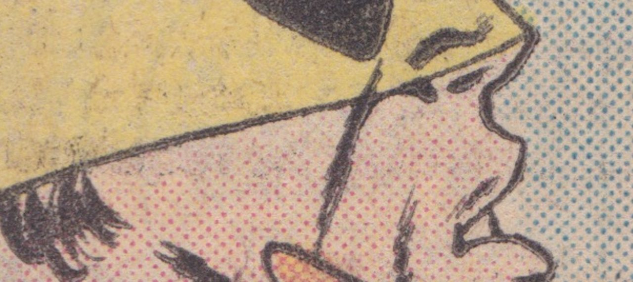
Poor color fidelity was just something DC and Marvel accepted in order to print cheap. Before the 1990s, a superhero comic had a palette of just 63 colors, which extended to 128 colors under some circumstances. Like any conventional printing process, all the colors in any comic are made of a combination of cyan, magenta, yellow, and black ink. The industry saved labor and money by limiting the densities at which colors could be printed: they used only 25%, 50%, or 100% density, with 100% being a field of solid color. In the 1970s a 70% or 75% dot was introduced (increasing the palette to 128 colors), but many of the 70% dots didn’t show up well enough on the absorbent newsprint to be functional.
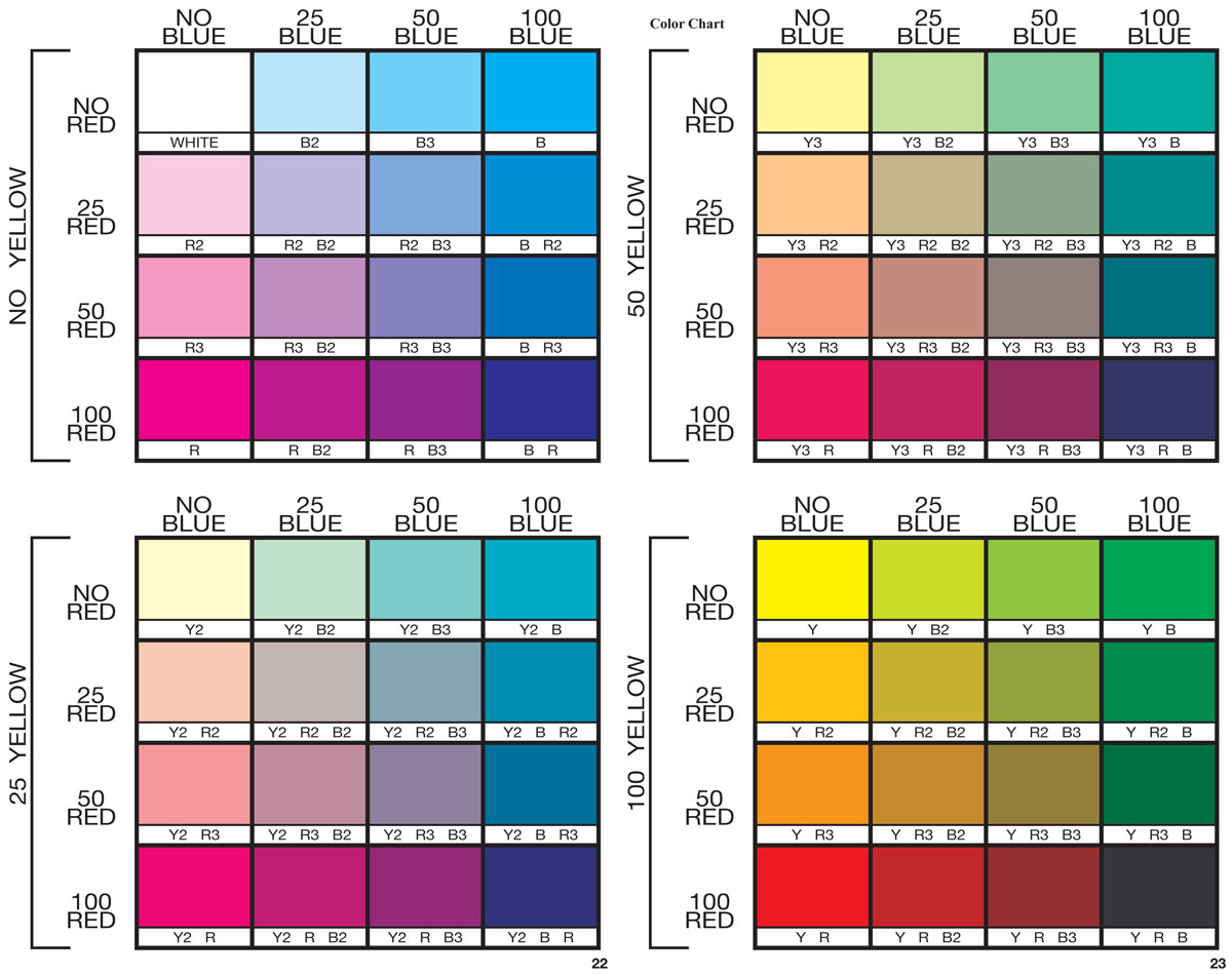
There is no white ink; “whiteness” is an effect created by blank paper, and highlighted by the darkness of the surrounding ink, or by printing low-density cyan in the “shadows” of the white object to counteract the yellowness of the newsprint. Brown is made with a combination of all three colors.
The colorist worked with an understanding of these printing limitations, but her own materials did not necessarily reflect them. I will quickly gloss the old coloring process as described in DC The DC Comics Guide to Coloring and Lettering Comics, a book made by industry professionals for amateur/aspiring artists:
First, the colorist, having received the inked and lettered pages, would scale them down and print them onto plain typing paper. They would then use inks or markers to color in the pages. Their own colors acted as guides; the artist would match the colors in her page with the colors available on a chart provided by the publisher. She would mark up her guide with codes to indicate the colors that she wanted used in printing. The guides would then be sent to a “separator,” a company which hired what the guide described as a “group of old ladies” making “minimum wage” to paint sheets of acetate by hand, one sheet for each density of the printing ink colors (cyan, magenta, yellow) and black, which would be photographed onto metal printing plates.
I really wish I could launch into a whole other paper about gender and comics color. There were so many woman colorists—think of the late, great Marie Severin (who started out as a colorist but was a brilliant penciler) and Tatjana Wood; the colorist is often the only woman working on a comic during this period, other than the regular presence of DC editor Jenette Kahn and a few other exceptions. The group of old ladies employed by the separator deserve their own extended attention that is unfortunately beyond my scope for now. I have to keep after the ink.
Brown Skin, White Paper
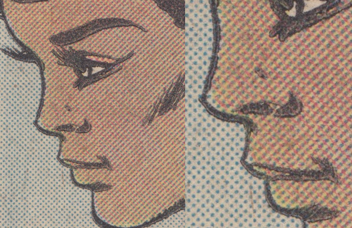
Brown skin in comics of this period fails in part because there’s too much ink. The layers of cyan, magenta, and yellow are unreliable and painfully noticeable. White skin, by contrast, is thoughtlessly stable. This panel is scanned from Power Man and Iron Fist #76 (1981).

Misty Knight’s face is striped and re-striped with red, yellow, and blue. This page doesn’t suffer any major printing errors and is an improvement compared to Hero for Hire #5 from nine years earlier, but Misty’s skin is still hypervisible, completely overwrought with un-skin-like ink. Compare it to Iron Fist’s.

His skin is actually more poorly printed: the dots fade out to nothingness towards his mask, and there are almost none around his eyes. However, it’s not as noticeable or distracting; the ink is very close in color to the off-white newsprint. White people’s skin is printed, I believe, with 25% yellow ink and 25% magenta. That coverage together would mean that around 50% of his skin is literally blank paper—a kind of on-the-nose adaptation of the “unmarked whiteness” concept. Yellowing and darkening of the newsprint over time, by the way, only make the inked white skin and paper closer together in color as the yellow dots become more and more indistinguishable from the paper.
The print methods adopted by the comics industry early in its history didn’t have any way to consistently reproduce the color brown. We can see even from these examples that the material infrastructure through the ‘70s and into the ‘80s was totally inadequate to the needs of the growing slate of black characters.
Tune in next week for the second half of this essay when we’ll see how the ‘80s, ‘90s, and digital color revolution inked dark brown skin.

