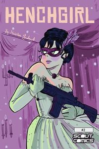
Recently, Scout Comics forwarded a press release to WWAC spotlighting two upcoming titles, Class Action #1, October 2015, and Henchgirl #2, also October 2015. The covers in the email were large and hard to miss. I’m sure that was the point.
And so began the visceral reactions.
 It started with a simple question like WTF? Soon followed by a snarky comment like maybe she has 9mms hidden under her breasts and that’s the only way she can reach them.
It was an offhanded comment meant to criticize and not critique. For someone not comfortable with critiquing art, going with the snarky comment was a cop-out. Thank goodness for editors who believe if you can take the time to snark, you can also take the time to look at two cover arts and compare them critically.
So, I’m going to pull my judgmental foot out of my mouth and discuss why the cover for Class Action #1 doesn’t work for me and why the cover for Henchgirl #2 does. This is a discussion of only the covers, as I’ve yet to read either comic.
And relax. I’m barely going to mention the side boob.
Neal Adams has been creating comics since 1967*. When press releases use the term “industry legend” as a descriptor, I believe them. I’d describe his style as gritty with a golden age feel and sorting back through his past covers I can say I really like them. I like his consistency and ability to tell a story on the cover that will most likely match the story on the pages.
From the blurb of Class Action #1 I can tell he’s achieved his intent of storytelling with this cover. Technically the art has done its job. This is where I have my personal reasons for disliking the cover. The main characters are on the receiving end of sporadic gun fire. I say sporadic because no one is getting hit. Our male main character (MC) is protecting our female character (FC)–still no personal problem with this. However, the MC is completely prepared for this gun battle, and the FC is not. He’s dressed–from black turtleneck to generic black spy shoes–as if he knew what was coming. The FC is caught unaware, seemingly lounging around naked until she was forced to struggle into some clothing. She appears weak, and the MC has knowingly placed her in harm’s way. The drawing of the MC’s arm moving the gun back and forth, as he shoots, causes the eye to drop down below it. And that enhances the focus on our FC and her dilemma. All my emotion is caught up in feeling sorry for this gal and it makes me a bit uncomfortable.
How would this cover have worked better? I think it would have worked if our MC had been in a similar state of undress, like, his shirt off and minus his shoes. Then both characters would come from the same point of weakness, even if our ex-super spy MC is anything but weak.
 Now, I’ll continue with the theme of weakness to explain why I like Kristen Gudsnuk’s Henchgirl #2 cover so much. Everything, from the machine gun placement, to Henchgirl’s chin tucked against her shoulder, says “I’m in control.” The art is focused on the main character and there is no question this is her story. I don’t quite understand why her thumb is on the trigger instead of her index finger, but because the sure-of-herself facial expression, I choose not poke at that small detail too much. I get the feeling Henchgirl knows what she’s doing. From this cover art comes a sense of empowerment. I like this feeling. And this feeling makes me want to turn to page one.
*Information on Neal Adams comes from his DC Comics Database Wikia page.

