
Maria van Lieshout is a children’s author/illustrator that is creating fresh, sleek, genre defiant picture books and is the subject of this month’s Picture This.
 Van Lieshout grew up in Oegstgeest, a small town in Holland, which by all appearances is an absolutely lovely place. After high school she attended The George Washington University in Washington, D.C. and pursued a degree in Visual Communications. After graduating with a BFA, van Lieshout returned to Holland and worked as a creative director for Coca Cola. Then, in a fun biographical twist, she won the Green Card Lottery and received citizenship in the United States. She currently lives in “a creaky 100-year old yellow Victorian in San-Francisco” and writes children’s books full time.
And I am so happy that she does. Her ki d’s books are post-modern, high contrast, depictions of life that always have a happy ending despite their existential tendencies. Her literary philosophy is to reinvigorate picture books as a physical medium, and that doing so means introducing complex topics, discussing the plot from various angles, and avoiding condescension at all times. There is so much to love in her work, but the most poignant part is her consistent injection of fear into the narrative. Examples abound.
Van Lieshout has illustrated several picture books, but for the purposes of this survey I am only analyzing works she has both written and illustrated.
BLOOM was her first published book, and is also the first in a small series of high concept picture books, followed by SPLASH, PEEP, and TUMBLE. Each installment is saturated in two particular colors, with a young animal main character that must process difficult emotional hurdles.
BLOOM! is about a pig named Bloom who grapples with the concept of love. She rejects her friend’s invitation to play in a puddle and instead dances through a flower patch, until she sees a butterfly pass by. Bloom thinks it’s a beautiful, flying flower and declares her love for him, but he flies away. She wallows in her own misery until her friend brings her a flower and asks her to come play in the puddle instead. This is a simple story about something very difficult for most people to do: accepting love from people that see you as you are.
SPLASH! is about a seal named, well, Splash that is deeply depressed. His coloring is a drab grey and he refuses to partake in any of the usual seal shenanigans ( i.e. swimming, playing, or racing). When he finally tries to engage with a concerned friend, the other seals laugh at him and he sequesters himself on an ice floe. He tells the sun not to bother rising and sobs, until he accidentally starts bouncing a ball. As he gets increasingly into the game, the sun rises and he starts playing with his friend again.
PEEP! is about Peep the chicken (there is a pattern here) confronting fear. He and his family are about to cross the road when they reach a high curb. His mom and sisters hop off the curb and wait for him to cross, but he is petrified of making the leap. Allowing his phobia to control him leaves him sad and alone. Even though it scares him, he must jump down in order to be reunited with his loved ones, and he does.

The final book in this small series is TUMBLE!, a story centered on three polar bear cubs that find a red scarf laying in the snow. Tumble is the first to encounter it, and then takes full possession. In retaining something for selfish purposes, he disassociates himself from others and slowly becomes miserable. His “wubbie” becomes a burden, and he is alone until eventually sharing the scarf and letting his friends connect with him.
Each of these titles showcases feelings of rejection, loss of purpose, and isolation followed by a shift away from self-destruction and rejoining their social relationships. The art is done with ink and watercolors, with the usage of only two shades in the overall color scheme. The palette is always initially dominated by one color, which is slowly overtaken by the influence of a second hue. The pages are predominantly white space with a large, clear typeface that spans across the page in jaunty, eye-catching formations. 
In an interview with Lynn E. Hazen, van Lieshout explained her preference for watercolor:
“My favorite medium is watercolor-it is not obedient, has a will of its own, goes where it is not supposed to, and if you let it, it will take you to great places.”
Many of her images feature the watercolor blending and extending beyond the borders of the inked images, made all the more striking with the contrast of the stark white background.
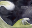
This ink and watercolor combination continues with the Hopper and Wilson titles, but with the added features of newspaper print and textured backgrounds. The message of the story is delivered in the same pull no punches style as two friends go on a trip to the end of the world. They board a tiny boat together to see what might be at the end of the ocean, and lose each other (and their balloon) in a storm along the way. They are lost and nobody will help them find their way, but once they find each other they swiftly find their way to the end of the world, which also happens to be their home. Sometimes the most valuable things in life are the people that are in it.
 Her newer releases follow a completely different aesthetic, calling on her graphic design background to detail sights common to their subject matter. Flight 1-2-3 portrays the experience of flying from one city to another with accurate airport signage, terminal maps, and iconography native to airports worldwide. Backseat A-B-See is an alphabetical exploration of a child through common street signs while on a drive. The introduction of the street signs alongside the letters is seamless and striking.
Van Lieshout’s artistic philosophy can be partially explained from this quote from her interview with Kitty Flynn
“Writers and illustrators must reward the reader for his or her attention by providing words and images that are thought-provoking and engaging.”

Each of her published works has demonstrated her commitment to engage with her audience through challenging messages, multi-layered storylines, and clever imagery. Even her Coca Cola designs were spectacular.

