

Welcome to Comic Cover Showdown, where we pit new comic releases against one another to see who has the stronger cover design. We’ll be critiquing covers by referring to fine art elements, so you should expect to come away from this with new knowledge.
This showdown’s theme is negative space.
Negative space is the space around the subject of a work of art. Usually, they’re filled in with background illustrations. The interior of a room, an outdoor scene, a patterned wall, or a blank area are all examples of negative space. They’re what you notice last in a picture, once you’re done looking at the focus of the design.
But did you also know that negative space could also be mistaken for a focal point in a piece of art? Some artists purposefully fill their canvases with subjects that can look similar to their active element (also known as, the focus), when they’re actually inactive (not the focus).
Let’s look at the cover for Big Trouble In Little China #4 for an example.

First things first: the lineart quality for this cover is wonderful. It’s brought down a little by the murky shade of green the colorist chose, as well as the logo placement being rather small and stuck in the center. On its own, however, the sketchy quality of the cover is beautiful.
Now, for the problem. The top half has our heroes, the subject of this cover, towering above the three henchmen. Wang Chi, situated in the background, is in a fighting stance while Jack Burton brandishes a gun. Within the cluster of protagonists, there’s a pleasant invisible line guiding us from each face. Your eyes are guided in a complete circle; never are you invited to break that gaze to look towards the bottom half.
The bottom half of the cover has nothing to do with the top. There’s little movement, aside from the three men holding up Jack and his posse with lightning. It’s almost as if they are completely unneeded in the cover at all. This is why they are referred to as inactive elements.
On top of that, there are no warm colors on this cover. It could be completely dismissed on the shelf because it makes no effort to stand out with coloring. Murky color = less money. Use warm colors somewhere in your cover to attract attention, or you can kiss those extra sales goodbye.
What would be a better idea is to switch the two groups around with the three men posing in the back. Make the logo bigger, place it towards the top, and now you’ve got a solid cover that doesn’t feel so divided.
Let’s move on to Alien Legion: Dead and Buried.
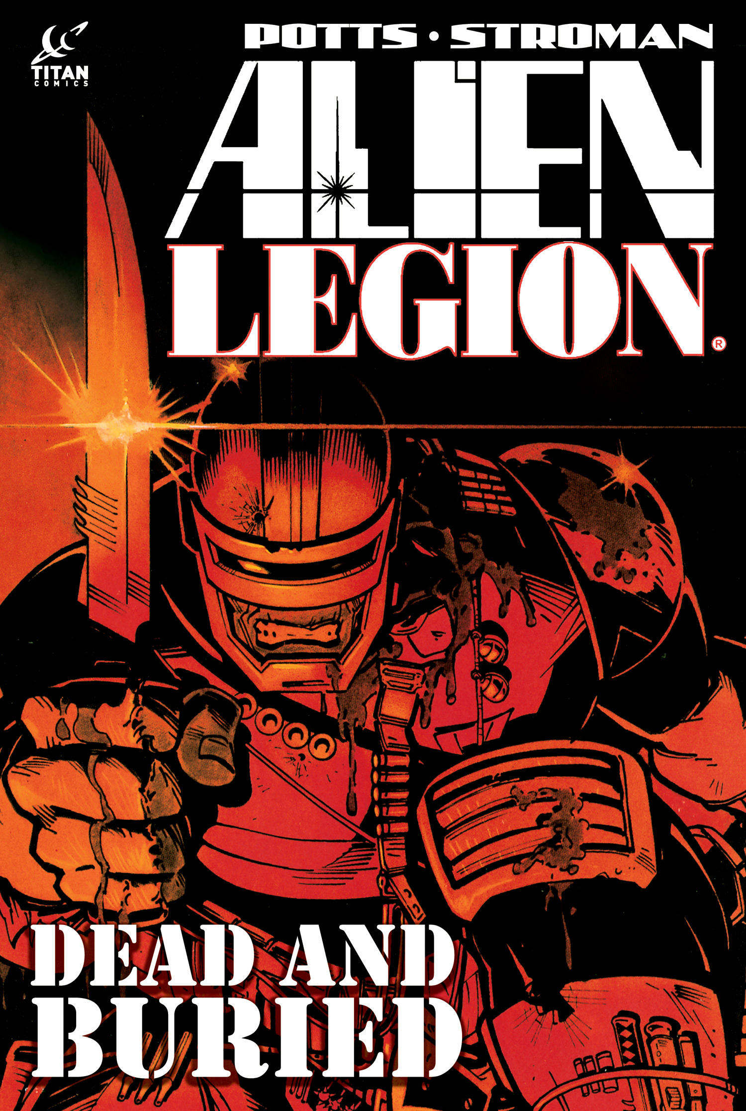
This cover of the Alien Legion omnibus is not my favorite variant, but is still a great example of how to completely fill a drawing area with an active element. Several tricks are used here with consideration.
The cover utilizes red for maximum effect. Red is a color artists can use to grab customers’ attention. When your book is sitting on a shelf and competing with other comics for sale, you want yours to stand out in the best way possible. A good way to do this is to use red, orange, yellow, or teal whenever you can.
It utilizes stark inking, so it’s mostly black and red. Very little gradient is present here. The title blocks out the subject by superimposing itself over the negative space, with lettering in white. Grimrod’s knife is perfectly nestled against the left side of the image. The viewer gets the gist quickly of what the book could possibly be about. Red is also a color of impulse (which is why Target uses it color for their store decor and logo). Warm colors = buy!
The Titan logo is a little off in its relatively small size in the upper left corner. It might be a better idea to either place it right next to the title or on the other corner, or maybe somewhere along the bottom. Grimrod also looks a little uncomfortable in his stance, but due to some Googling, it turns out that it’s because of a weird crop.
It would be difficult to improve the picture without tilting the image (which a later variant does) to fit the title and credits in a little better. This isn’t a bad cover, though.
What’s a good way to tell if your cover is sellable, you ask? Let’s shrink both images down to thumbnail size and present them, one next to the other:

Who wins? What image conveys a clear message?
Cover design can make or break your book. Design wisely.
WINNER: Alien Legion.
