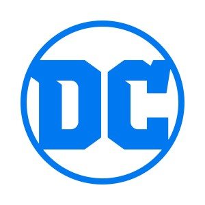
DC Entertainment released their new logo, along with a press release explaining its new branding and the motivations behind its decisions. See below for the full announcement. I have highlighted a few key phrases that point toward DC’s branding direction.

New Logo Design Celebrates DC Brand’s Past, Present and Future
Logo to Debut on May 25 Release of ‘DC Universe: Rebirth Special #1’ by Geoff Johns
DC Entertainment announced a new identity and logo for its iconic DC brand. The new DC logo is a mark that leverages over 80 years of heritage with an eye toward the future.
“While comics continue to be the heart and soul of DC, the brand has evolved to now stand for powerful storytelling across so many different forms of media. DC is home to the greatest Super Heroes and Super-Villains, and the new logo has the character and strength to stand proudly alongside DC’s iconic symbols,” stated Amit Desai, DC Entertainment Senior Vice President of Marketing and Global Franchise Management. “The launch of the new logo is the perfect tribute to DC’s legacy, exciting future and most importantly, our fans.”
The new logo will debut on the cover of the highly-anticipated DC UNIVERSE: REBIRTH SPECIAL #1 comic book written by Geoff Johns releasing May 25 and available in comic book shops and digitally. REBIRTH represents the next chapter in the ongoing saga of the DC Universe, mixing traditional values and a modern aesthetic.
“I’m very proud that REBIRTH will be the first comic book published with the new DC logo.” stated Geoff Johns, DC Entertainment’s Chief Creative Officer. “To me, REBIRTH and the new DC logo are built on what’s come before while looking to what will come tomorrow. I can’t wait for people to see it on the cover.”
The new DC branding will be introduced immediately on various digital platforms, including DC websites, social media channels, DC All Access webseries, and DC All Access app and will continue to rollout worldwide across all DC content and products. One of the many benefits of the new logo design is its versatility to showcase DC’s iconic and timeless characters and stories across all media. Look for the new logo to come to life at key events in the coming months.
The new identity and logo were developed in partnership with Pentagram, the world’s largest independent design consultancy.
Old logo

This new logo replaces the previous logo that debuted relatively recently in January 2012 (oddly, not at the beginning of the New 52 launch, which occurred August 2011). Public reactions to this logo were mixed, probably in response to contradicting statements from DC representatives and the logo’s unclear visual. While some said that the peeling of the D represented dynamism and the action of turning a comic page, others suggested that the logo suited a digital-forward and multi-platform strategy (to which I ask, what digital and multi-platform strategy?). The same Desai mentioned in this logo’s press release suggested that the D and C represented the dual identities of superhero and secret identity, while critics responded that there was nothing “superheroic” about it.
Needless to say, DC had needed rebranding for a number of years. The 2012 angle was not the answer.
New logo
With the new logo launched a mere week ahead of the upcoming Rebirth initiative, the marketing process behind DC Entertainment already appears more streamlined. While the new logo’s style means to suggest a vintage aesthetic (contrary to the “modern aesthetic” claimed in the press release … hmmm), DC Comics’ executives have largely touted the same of Rebirth, with publisher Dan Didio stating that it “is designed to bring back the best of DC’s past … We are returning to the essence of the DCU.”
(He goes on to say, “We also believe in the direct market and the core comics fan,” which history proves is a contradiction of the press release’s “versatility” angle. It might also be the most corporate-sounding gatekeeping I’ve ever heard in my life.)
I’m still musing about how I feel with this new logo, but likely it will go the way of the old in that I’ll eventually have no strong feelings about it. The one thing that stands out to me, however, is its color. In some images, it appears periwinkle, in others a truer blue. If DC meant to harken back to its legacy, wouldn’t it have made more sense to color their new logo in a way that represented the coloring techniques of the Golden Age, by choosing a more primary shade?

Why blue anyway? Does it have something to do with main competitor Marvel Comics having a logo with a red background?
As for the new D and C lettering style, I have a few friends who have expressed dislike for it. The kinks in the letters put them off (Jim Lee’s explanation has cleared up nothing—I think I see the Wonder Woman letters in the top part of the D and C and others have suggested the sharp points in the upper left insides come from the Batman icon. But then where’s the Superman influence?). Many have opined that the logo either looks like varsity letters or belongs on athletic gear, which—since DC Comics’ (and DC Entertainment’s, for that matter) primary product has nothing to do with sports and the word “jock” sounds like poison to some of its reader-base—is not a good sign.
The general direction behind the logo, from what DC has revealed, seems solid. The sans-serif font in 2012’s logo didn’t benefit the company’s branding in any way, looking solely utility-based rather than pathos-based. Inarguably, pathos-based is a better direction for DC Comics, because the only thing that has kept the company (and the superhero genre) alive all these years is comics readers’ deep attachment to the characters. However, good direction means nothing when final execution fails to inspire the associations the company wants consumers to have when they see it.
Now, here’s where things get problematic:
Rebirth […] mix[es] traditional values and a modern aesthetic.
What, exactly, are these traditional values?
Here’s the problem of the lack of specification in that area from a branding perspective: All strong companies know their values. Values are an integral part of the branding process in that they help the company underline their distinction from the competition and explain how their existence benefits society to their consumers or stock investors. In order to move in a clear path toward progress, a company needs to be able to enunciate these values, usually internally to their employees, but often externally as well if they are a media, entertainment, or tech company. My former employer fashioned itself off “being fearless,” as in it was both willing to go the extra mile for clients and try things no one had dared to think of or execute. One of my current employer’s clients bases itself off “responsibility” for its customers (it’s part of a field that has had a lot of bad press for NOT acting responsibly) and the implied compassion that comes with it. Disneyland, one of the strongest brands ever, has the motto “Happiest Place on Earth.” Notice how much the adjective carries in that short phrase.

In order to have strong branding, DC needs to be able to articulate what values make up their foundation. Since they did not, I can only assume that they don’t know what those values are—that they don’t have strong branding—which means that they don’t have a clear direction on where the company is supposed to go from here. That’s bad news for a number of reasons, but particularly at this juncture because rebranding is supposed to help a company turn over a new leaf. If you don’t understand precisely where rebranding is supposed to take your company, you might as well not do it.
However, even with DC’s vague choice of words, readers still have prior associations with the word “traditional.” Some positive associations can include familiar, comforting, warm, reliable.
If you’re younger, of a certain political leaning, or part of a marginalized group, however, it can have many of these negative associations:
- Sexist
- Racist
- Homophobic
- Transphobic
- Xenophobic
- White supremacy
- Patriarchy
Conclusion
I would not take this action as a strong sign of DC Comics’ growth moving forward, because the question I posed is facetious. I know what DC’s values are. It values protecting its employees who sexually assault women, it values preserving a hostile work environment for women when it doesn’t outright fire them after 20 years of service, it values a white perspective by offering limited representation of other races in their books, and it values not giving queer titles the support they need.
Let’s not be naive. DC Comics doesn’t need a rebranding—it needs an overhaul. It needs new publishers and an editor in chief. It needs leaders who not only know how to run and grow a company, but also will treat people with fairness, professionalism, and respect (which isn’t to say that these are separate issues; it’s been consistently proven that “treating people with respect” and “company growth” go hand-in-hand).
I know it’s not going to happen and that’s a shame for those DC employees who absolutely are good people and who do their best. However, I won’t lie. I feel a little bit of schadenfreude every time I see DC lose industry stock to its competitors. And I predict we’ll continue seeing more of that in the future.


How you know DC is truly corporate? “We keep losing stock to our main AND lesser competitors, and have lost goodwill built up for decades on quick cash-grabs on shoddy material.” “Perfect! A raise for everyone in upper management!”