

We all know the common problem with female bodies in comics: oversexualized, unrealistic, packed in tight suits, bent at unnatural angles and looking seductive even in the midst of a battle.
The supporters of such representation of women—those who insist that an armored tankini is a smart distraction technique—are willing to explain to you the reasons for female superheroes to look like this. Yes, they are fit because they work out and kick asses. Yes, they can freeze in a position that gives you a simultaneous view on the chest and butt because they do stretching and probably have a nice yoga instructor. Yes, big boobs and dramatic cleavage are necessary for saving the world because…uh, because why not, okay?
But one thing about superladies’ appearance you can’t explain with regular cardio and superpowers is that their faces that look disturbingly alike.
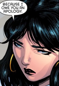
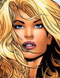
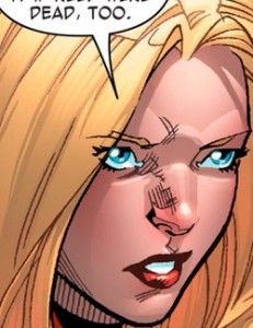
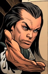
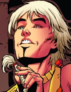
These are Wonder Woman, Hera, and a young Amazon drawn by David Finch. Have you ever seen three females with such similar facial features at the same place, besides a Victoria’s Secret show or Hugh Hefner’s mansion?


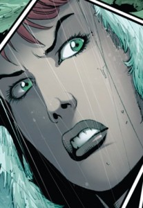
Silk and Spider Woman are depicted in a way that makes me think that a particular BMI, lips’ size, and hairstyle are the necessary conditions for gaining spider abilities.
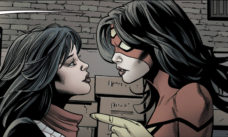
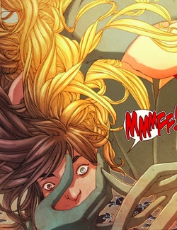
The distinction is so subtle! Wait, what is Spider Girl doing in here? We do not welcome ponytails!
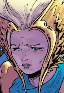
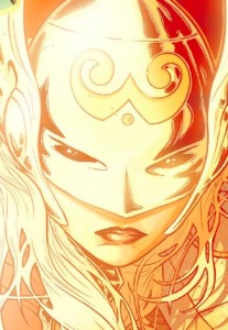
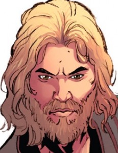
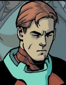
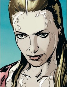
New Thor is written with great respect to women and understanding of gender issues (“That’s for saying ‘feminist’ like it’s a four-letter word, creep!”), and the art is spectacular thanks to Russel Daughterman. Still, Scandinavian Freyja, Romanian-born Scarlett Witch, and Thor Girl would look the same if you’d imagine them with helmets off.
A great artist as he is, Russel Daughterman is prone to give his female characters heart-shaped faces regardless their age or origins. Compare Jen, an average American kid, and Sonia Zucco, a daughter of a mobster with Italian heritage, in Nightwing.
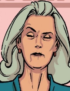
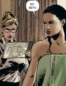
Everywhere in comics, Caucasian women are allowed to have only one head shape, nose, lips and eyes. This is how youth, maturity, and old age look in the world of Ant-Man: Scott’s daughter, her mother, Dr. Erica Sondheim, and the bank lady are basically the same woman caught in different ages.
Pay attention to the fact that Ant-Man has a cute “indie” art style: normal men instead of walking, talking piles of muscles, and seemingly normal women, who don’t dress like they forgot to change after taking the first prize at a bikini body competition. This type of comics is supposed to show superheroes like ordinary people in an ordinary world; still, it doesn’t grant the women a right to be normally diverse.
Why is it so?
It’s not just the artists who are to blame. Intentionally or not, they follow the direction that western culture provides. “A woman should be pleasant to look at,” the society says, handing a detailed manual: high cheeks, full lips, dramatic eyes, long thick hair. And don’t you dare to step away from these rules if you want to portray a really conventionally attractive girl!
While a creator might wholeheartedly believe that these specifications describe the only way to draw a beautiful woman and that all the women in a book should be hot, the fault still lies with the entertainment industry and our society in general, rather than on particular creatives. There are so many people around trying to fit women in generally accepted, stereotypical standards of beauty—including the women themselves!
Comics reflect this sad reality. As the result, we’re attacked by clones—dozens of female characters that appear all the same, both protagonists and supporting cast.
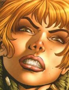
There are not a lot of female characters in Red Sonja besides the “she-devil with a sword” herself, but if the script introduces a girl, you can be sure she’ll look like Sonja with a different hair color.
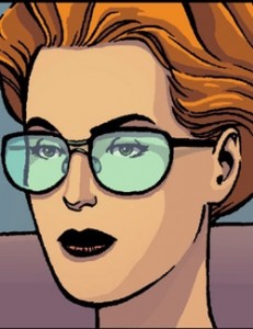
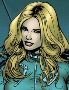
In Black Widow, drawn by Phil Noto, ladies have slightly different face shapes and noses. Their eyes and lips are similar, though.

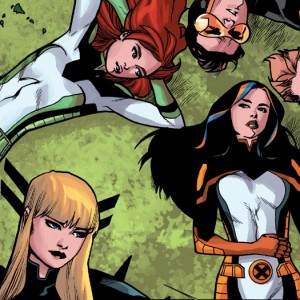
Would you be able to tell the All-New X-Men girls one from another, if not for their apparel and hair?
And, of course, Zenescope’s books, which showcase the extreme of objectification in comics. Inspired by the Grimm brothers and Lewis Carroll, these comics don’t contain a single unique woman’s face and resemble a catalogue of sexy role-play costumes with only one model, who just changes makeup and wigs.

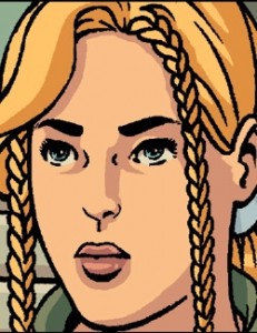
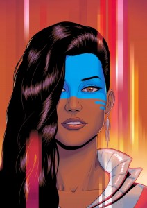
These are Arwyn from Sojourn, Osmium from 1001 Arabian Nights, Emma Frost, Wonder Girl from Teen Titans, Black Canary, Invisible Woman, and Captain Carol Danvers all drawn by various artists. Oops, I messed up the pictures’ order! Could you tell who is who?
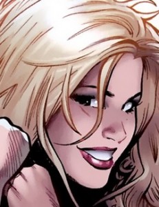

Don’t you get the feeling that these artists, with their differences in artistic styles, are drawing the same lady? She’s a glamorized blonde with nicely-carved cheeks, pointy chin, cherry lips, and a ninety-dollar blowout; a highly sexualized and unrealistic girl that lives only on ‘90s Playboy covers.
Speaking of which, I feel obligated to mention Greg Land, the artist of aforementioned Spider Woman, Sojourn, and X-Men (his Arwyn and Emma are second and third blondes in the collection above), who was more than once caught on tracing his women characters from porn, which therefore gave birth to the term “pornface.” I have no idea what kind of people would mistake a false orgasm on girl’s face for battle rage, but porn could probably be helpful if you want to reproduce a seductive look. And, as we know, women make these faces twenty-four hours a day, especially when they casually slice some space monsters with a sword.
Greg Land is one of those creators who I feel deserves blame for this epidemic. It speaks for itself that a penciler who uses references from an industry that treats women like disposable generic things, both on screen and through employment contracts, would not be invested in creating unique looking heroines (not to mention that it’s just unprofessional to straight up trace photographs). There are male pornfaces as well, but girls fall victims of this mockery more often than lads.
I can hear people from an “it’s a distraction technique” crowd yelling: “Hey, what do you want, a darn La Gioconda in every issue? It’s a stylized representation that could omit details. You can’t expect an artist to make things realistic, we’re not in the Smithsonian!”
Why, then, are the male characters from the very same titles not missing details that make them diverse?
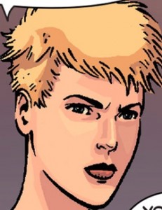
These are lads from Spider-Women, all drawn by Greg Land.
And here are guys from the single issue of Red Sonja.
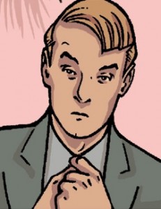
In Ant-Man, even some boring bank clerk deserved unique brows and a prominent fringe!
Stylization doesn’t stop Babs Tarr, the artist on Batgirl, from making all the girls different. Though cartoon-like illustration simplifies things as much as possible, Tarr managed to find a solution, such as an emphasis on a girl’s complexion or bold hairstyles. It turns out there are so many things an artist could play with, from facial expression and nose shape to lip(stick) color!
In Spider-Gwen, female characters are easy to distinguish thanks to individual details such as plump lips or a long face. Gwen stands out from the page with her mop of blonde, almost whitish hair, and she’s the only one with such a style. Doesn’t it feel good to give characters a chance to be unique?

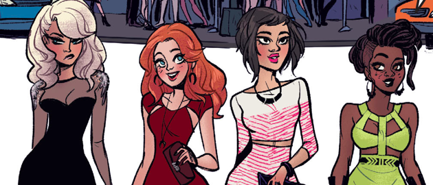
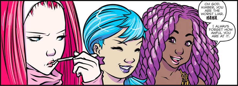
Jem and the Holograms do just fine! And it’s not only about hair color and accessories—Sophie Campbell makes sure they really have different chins, cheeks, and noses.
Even in comics that gravitate toward the realistic style, it’s possible to make a female lead that stands out. Here’s Velvet Templeton from Velvet, drawn by Steve Epting. Her sharp features reflect her harsh, purposeful personality, though beauty editors of fashion magazines barely would call her an appropriate model. With or without these white strands, you’d recognize her!

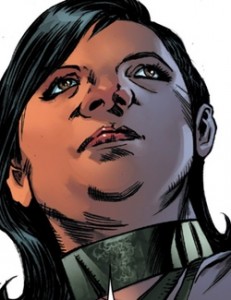
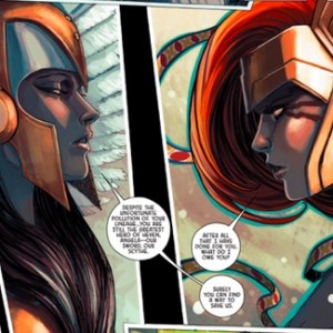
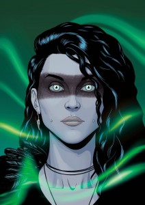
The story of Angela, Asgard’s Assassin, teaches us that women who are not meant to please an eye (like Freyja) or represent a role model (like brunette Sera), could have an authentic appearance. But those who are supposed to draw attention of readers of both sexes (Angela and the Queen of Heaven) are damned to wear cliched revealing armor and look ridiculously alike.

Characters of Fade Out look and behave exactly like you would expect from Hollywood elite of the ‘40s, including lighting up a cigarette in every other panel. Though ladies don’t appear identical (you can easily tell one blonde starlet from another), they are drawn in different manner than men. Their skin is unblemished, as if shadow doesn’t dare to touch it, not to mention wrinkles. Here are Charlie and Maya in the same scene, under the same light.

All along in the comic women are depicted as if the artist didn’t put shadows on their faces, concerned that they might lose attractiveness and Hollywood gloss. Guys are very diverse and unique here, I must admit—folds and wrinkles give them drama and personality.
My favorite example of dissimilar characters is Rat Queens. Their lips, eyes, ears are different. And still they all are handsome!

Also, the Rat Queens are designed in a way that allows us to tell one from another just by a quick look at their hair, complexion, and clothing. And it’s a great trick, considering that, indeed, sometimes illustrators don’t have enough time to draw all the characters in detail and need to figure out a quick and smart way to make women diverse.
For example, you’d never mistake one Carlyle sister for another in Lazarus. The scientist, the warrior, and the trickster—their personality shows at their faces (oh, that sweet and cunning Johanna’s expression!), clothes, stature. Half-naked Forever with damp hair never looks like Johanna getting out of a swimming pool.
The Wicked + The Divine must be a cosplayer’s dream, because the comic does not have dull or plain characters. These weird hairstyles, outfits, and jewelry not only refer to origins of new gods, but also tell us about their personalities. Bright colors for soft-hearted Amaterasu, a black stripe over Morrigan’s eyes to emphasize the dark things this Celtic goddess stands for. Lucifer’s fair complexion and white suit reflect her cunning nature, as she pretends to be the one in a white hat till the end.


Their on-page appearance is who they are, not just makeup they can remove.
One more awesome example of character design that helps the character to stand out in any crowd is Harley Quinn. You’d always recognize her, despite significant changes of her outfit.
Storm is perfectly recognizable too, with the suit or without.

When it’s not always in artist’s power to change the initial character’s design, it’s possible to use a simple trick, such as hair color. Thus, in Ms. Marvel Kamala is the only one with thick dark hair, which turns golden as she transforms into Ms. Marvel.
This also works in Batgirl and Spider-Gwen.
So why does this happen with some female characters and not with others? I might say that that some characters are meant to be average outside their hero identities—it’s basically the idea behind any superhero. An average college student becomes Spider-Man. An average millionaire becomes Batman or Iron Man. An average woman gains superpower and saves the planet; a few panels later we see her living her ordinary life, looking like any other average women in the story.
But it’s just a part of the truth, because average women don’t look like models, and, what’s more important, average women differ. For centuries, women in fiction were no more than protagonists’ romantic interests at best and beautiful furniture at worst. Most modern movies still can’t pass the Bechdel test, and considering the very idea of the test first appeared in a comic, I dare to say that comics do much better than the big screen.
With the cultural background we have there’s no surprise creators find it so hard to represent a woman as a strong personality in the first place. Just imagine this: every creator wants the character to be loved, and when beauty is the main thing our society appreciates in women, it’s easy to see why they choose this way.
I think it’s important to become aware of these things and search for ways to make characters diverse. That could be their face anatomy or habitual expressions. That could be wild makeup, jewelry, or body modifications. That could be some special art technique or smart character design or silhouette. But please, don’t make all the women look like they compete for Playmate of the Year in their spare time.
And finally, I can’t stay silent about male characters who have this issue too, albeit not that in the same scale as woman. Superheroes are “supposed” to look masculine, so they have wide faces, massive jaws, large brows. There’s not a lot of variations of a face you can draw like this, though beards and mustaches could add some traits to a portrait. Still, all the guys from Bruce Wayne’s family look like Bruce’s clones of different ages.

It’s a better fate than the one female characters have (being “heroic and beautiful” instead of just “beautiful”). However, it needs to be changed too.
We are different. And beauty is different. Go make sure, take a subway ride.

Not just comics either. Switch on television in America and 90% of the women look the same. Same eyes, same noses, same face shapes. Skin tone can sometimes vary a bit. But there’s incredible homogeneity of look in the people deemed acceptable to put on television.
Likewise in movies, though not ~quite~ as bad as television.
Sorry, there’s really nothing deeper to this issue than “personal style” and “crushing deadlines”. It isn’t a recent phenomenon (Jack Kirby says hi), it isn’t remotely exclusive to western culture (Akira Toriyama says hi), and any given culture’s stereotypical beauty is only nominally involved, if at all.
Well, it’s not breaking news that gender issues existed in all times and that they exist in different cultures. I don’t think artist’s style or deadlines make a good excuse. We don’t accept it as an excuse for poor page composition, or poor anatomy, or other visible flaws of artists’ work. We make jokes about Liefeld’s feet because an artist should know how to draw feet, it’s kinda required. So the skill to make characters look different should become a required thing too. And I can’t agree with the last part of your commentary. As long as we don’t have more characters like Sera from Angela and as long as main characters are not allowed to look like Sera, stereotypical beauty is involved.
An artist’s style is their style. In the vast, vast majority of cases there are going to be certain similarities there from the jump. Throw a looming deadline at them and streamlining the process becomes an unfortunate necessity. That means stripping away some of the small details (facial features, for instance) while maintaining an overall level of quality that otherwise remains high enough for publication.
That shorthand version can very easily become an artist’s new normal (assuming they were ever better than that in the first place), of course. It is unfortunate, but that’s still all there is to Sameface Syndrome. I’m not claiming it’s necessarily a good, or sometimes even remotely acceptable, excuse. I’m just saying there’s no greater conspiracy at play than that.
As for the stereotypical beauty point, it’s irrelevant because it’s an entirely separate issue from Sameface Syndrome and has no bearing on the phenomenon’s existence. Stereotypical beauty is merely the look that’s easiest to sell. So if that dramatically changes all of a sudden, you are gonna still get a whole lot of Sameface going on. It will just in the form of whatever the new version of stereotypical beauty looks like.
I don’t know why you’re so invested in your maintenance of this status quo but it’s quite boring. Sameface is common, stereotypical beauty is precisely as common, and all you’re doing is agreeing with that? Which the article already does. So thanks for your investment, but it’s probably best spent elsewhere.
they’re not agreeing with it. they literally said that. they’re just explaining why this situation can occur. artists are lazy or have no time. many of them juggle multiple books or work other jobs just to make ends meet. and drawing is hard. making faces look distinct from each other and fit the unique background of each character and the artist’s style is hard and time consuming. so the art suffers. this doesn’t happen to only female characters. because sometimes artists only learn to draw males one way and females another way and there’s that, end of story. it’s not sexism, it’s laziness/incompetence.
And yet…
It is sexism. It promotes sexism. Liiissssteennnnnnn.
I think I see your point. Let’s assume the phenomenon of similar women faces is the result of streamlining as a necessity plus stereotypical beauty standards. But wait, it doesn’t make the whole thing less sexist!
Maybe you don’t see a problem here. For me, it is a problem. And I talk and write about this not because I want to put a blame on particular creators but because this needs to be changed and it won’t unless we talk about it. It’s not okay that Sameface is a face of a glamorously made-up model, whatever is artist’s reason. Sure, there might be other factors in play, like guidelines of companies who own the characters or tough deadlines the companies set. Let’s say the companies are in charge, then. Just let’s not say it’s okay because they have The Reasons.
I take it you’re not an artist or you wouldn’t be saying half this shit. my points can be summarized as this: A)the characters don’t belong to the artists, they belong to the creators so they don’t always get a say in how they’re drawn, they get paid to draw it how the creator wants it. If they don’t they get fired and the creator finds someone who will do what they want. B)Consumers don’t like to wait for their story so the artist has to draw as good of quality as they can in what little time they can get it so sometimes even mistakes make it to print. Quicker art means less time for details. C)what’s popular sells, if chubby girls were in you could bet your ass there’d be a lot more chubby girls. It’s just a cold fucking truth. Fact of the matter is THE ARTISTS NEED TO EAT! I’m sorry but they’re not cold hard machines made to please you. They have lives and need to make a living just like everyone else. D) I can tell those characters apart at a glance even if I don’t know who they are, I can tell they’re not the same person frankly. E) Actually a lot of comic art is not anatomically correct so that’s a horrible point you made, some are even perposefully not so because that’s their style.
Point is, get off the artists ass, besides they’re the ones being hired for this shit, if you can do so much better than you go out and draw a comic, that’s why a lot of non professional artists are making their own comics and drawing characters how THEY like them, it’s called fan art.
Peach, Nadia is not on anybody’s ass. She has written an article on a commentary website. Please try not to become so high-contrast.
I get the feeling you’re not actually that sorry at all
I am a little bit, but I’d be a lot sorrier if most of the examples and/or explanations used in the post were any good. Actually, I probably would have never showed up in the first place if that were the case, because the link never would have come to my attention if it weren’t being called out as BS by some artists I know.
I feel that this is a cop-out because, as the article proves, other artists are creating facially diverse female and male characters in their work. Yes there are stylistic cues and similarities in every artists work, but literal same face is just laziness on an artists part. It’s no different than writing a story. Certain tropes and narratives are always going to be seen in a writers work (Kelly Sue says hi) or a certain dialogue style (Joss Whedon hello) or a author specific voice (Keiron Gillen, Yuu Watase, Kaori Yuki, Brian Bendis) in their work. However, if those writers told the same story with a different setting (ie a different costume or hair color like on comic characters) than there’s a clear problem with their ability to write a story. Comics are visual mediums to tell a story, and as such, the artwork has to reflect that. Right down to facial structure and expression. Especially when other artists are already doing it, why can’t others?
The article is kind of a scattershot mess that proves nothing. To my eyes, there either isn’t that much actual Sameface going on in the examples of bad female faces chosen or most of the male characters and some of the good examples of female characters are just as bad. This is not helped by the criteria used to distinguish good from bad being inconsistently applied. On top of all that, there is a bunch of irrelevant padding that bogs the whole thing down.
Truth be told, you present a more compelling argument than the article itself does, although I can’t quite get on board with the writer comparison. The stylistic touches of some generally well-regarded writers do make a lot their works feel almost interchangeable, but they are still talented enough that it’s hard to dislike their work. Sup, Aaron Sorkin.
For the record, I’m not really trying to defend Sameface so much as explain why it happens (original comment does look more dismissive than intended; my apologies), because the writer of the article seemed to think there was anything more to the phenomenon’s existence than being rushed or lazy or just a mediocre talent (relatively speaking). It isn’t necessarily a valid excuse, but there also isn’t really anything more to it than that.
As for why some artists who are presumably capable can’t keep things different enough outside of circumstances that might necessitate it, well… Everyone is human and no two humans are quite the same. Not everyone handles pressure well, not everyone is highly motivated, not everyone works fast enough, not everyone is that focused, and some just might not even notice. I guess you’d have to ask any given artist you have a problem with to know for sure though.
Kamala’s hair doesn’t stay blonde after “transforming.” It was only an initial issue due to internal conflict, not a way to disguise the character or use different coloring. Once she resolved her issues with herself, her appearance remains the same in or out of uniform.
You’re right, it happened in first two issues, as far as I remember. But whichever is her hair color, she’s always the only girl with such hair. It’s a foolproof way to distinguish her from other female characters.
We have an issue. We have a good treatise on the subject. It certainly is a problem that must be solved. As always I must ask: What do we do now?
As I said, we need to become aware of this things. We need to talk about it. Write about it. Explain people what’s wrong with it. I believe it’s the way to changes.
Change.
I remember reading this Avengers comic and when the guys took their masks off I literally could not tell the difference between Clint Barton and Steve Rogers. I know enough about comics to know those guys should not have interchangeable faces (or bodies, for that matter), but they both had blond hair so I had no other cues to distinguish them. There’s no defense for it, that’s just an artist who can’t be bothered to break the “Strong White Male” mold they use to draw heroes.
So true! I had the same thing with new Ant-Man. When Hank came to Scott and asked his helmet back, I really spent several minutes just figuring out who’s who at the page. In a way, the thing with women is more tricky because it gives cues that allow to tell one heroine from another so reader doesn’t get confused, but the whole thing just silently promotes conventional beauty as the only way to be, well, a woman.
I think the fear of making women look ugly has driven the depiction of all female beauty into this increasingly narrow vision of acceptability, and when you make Silk look like a younger Spider Woman clone you need to go back to the literal drawing board.