
Lilly Pulitzer! Not usually our bailiwick. An American clothing brand for the modern-day Jackie O throwback, if Jackie were more of a follower and went for ditsy prints instead of block colour. But they’ve gone and brought cartooning into their PR yard, and they’ve used it for evil, and that makes it our business, awrite?
I won't stop talking about how horrific this is, @LillyPulitzer. Explain why you cultivate a culture of hate. https://t.co/XkzQYJ1A5s
— Sarah Conley (@imsarahconley) May 26, 2015
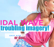
See the fat-shaming cartoons that decorate Lilly Pulitzer's headquarters: http://t.co/iYmOkymEo0 pic.twitter.com/8jon0gYhGU
— The Goods by Vox (@thegoods) May 26, 2015
Lilly P let a NY Magazine photo essayist into their HQ, and snapper Amy Lombard let twitter see what it didn’t want to know but doesn’t seem surprised at: Lilly Pulitzer corporate, apparently, hates fat people. In recent months Lilly Pulitzer have collaborated with Target to produce lines in up to size twenty (although their regular, core-brand website allows you to search only up to sixteen or XL). But that’s just economics. The Cut’s added captioning specifies that the images are “the personal illustrations of an employee not pictured in this story”, but! When you have pictures up in the editorial and management areas that suggest suicide as a ~jokey, fun~ response to a body that carries a lot of fat, there’s poison in your waterhole. Is there hemlock in any of those floral prints? Nightshade? Monkshood?
Then again, perhaps it’s unfair to suggest that a personal problem is necessarily an environmental one. What if the top people at Lilly Pulitzer are actively working to help this staff member pushthrough her negative feelings about fat? What’s if it’s a slow process and they don’t want to rush it? Is this the photographic equivalent to some rando asking Justin Bieber—of all people—what his thoughts are on abortion? Is it relevant to document the illustrated self-hate of somebody who, from the small area of wall covered by the photograph in question, appears to be mostly employed as a colour-based pattern designer?
Yes, it’s relevant. Because once illustrated, these opinions are externalised. They get into the discourse and the thought patterns of the people who share the space. It can hardly be avoided. That’s why we argue against hyper sexualised superheroines in non-pornography books, and voice our disgruntlement at sexist playsets, and ask why you can’t buy Black Widow on a shirt for an eight year old. Somebody who works to create visuals should understand that, and the team leader of a visual creative environment should understand that, and the people who work at a high level of an entirely visual lifestyle clothing brand should understand that. These cartoons are hurtful. They should not be proffered.
.@LillyPulitzer Why is okay to make fun of people you don't even serve as customers o a regular basis.
— ariel two belts & chins (@kiddotrue) May 26, 2015
.@LillyPulitzer Of course, we're not expecting anything more than a "Sorry you're offended" apology which is literally terrible & insincere.
— ariel two belts & chins (@kiddotrue) May 26, 2015
.@LillyPulitzer And please don't suggest that there's irony in the cartoons. There's no way to spin a suggestion of "kill yourself."
— ariel two belts & chins (@kiddotrue) May 26, 2015
So, this is why I get in my feelings about companies that won't serve plus sizes because I know sometimes their bigotry involved.
— ariel two belts & chins (@kiddotrue) May 26, 2015
But let me pull up out my feelings because honestly, I don't care that much about the brand. What I do care about is "in office jokes."
— ariel two belts & chins (@kiddotrue) May 26, 2015
If I could return my Target purchase, I would. I know it wouldn't directly hurt them, but you clearly don't want me wearing your clothes.
— ariel two belts & chins (@kiddotrue) May 26, 2015
And honestly, I believe that one form of bigotry usually indicated you've got other -isms you may not publicly endorse but secretly allow.
— ariel two belts & chins (@kiddotrue) May 26, 2015
This is where the intersection of wanting cute clothes and politicized activism kinda meets.
— ariel two belts & chins (@kiddotrue) May 26, 2015
Looking at the cartoons themselves, it’s interesting that it’s the captioning that puts them over the edge. As illustrations, they’re fine—they’re not actually vicious, if you don’t think that fat alone, a rounded belly, a weighty breast, is ugly. They’re literally JUST images of fat white blondes with long hair. If cruelty was intended in the draughtsmanship, the illustrator failed. Does that mean there’s hope for the person who drew, presumably, “themselves”? You know you aren’t disgusting. You know it. You just tell yourself you are.
If these drawings weren’t cartoonised, weaponised, with the addition of negative and spiteful written language there’d be no problem with them at all.
So it’s corporate, then. The bigotry. Right? Tell me how that ain’t so.
